I was asked by the Lesbury community to design a logo for the new village shop that was planning to be opened in the near future. As a resident of Lesbury I wanted to capture the iconic scenery such as the bridge, the viaduct and the countryside landscape.
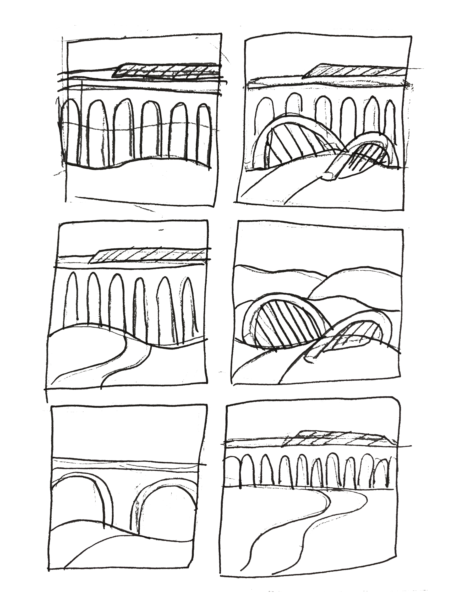
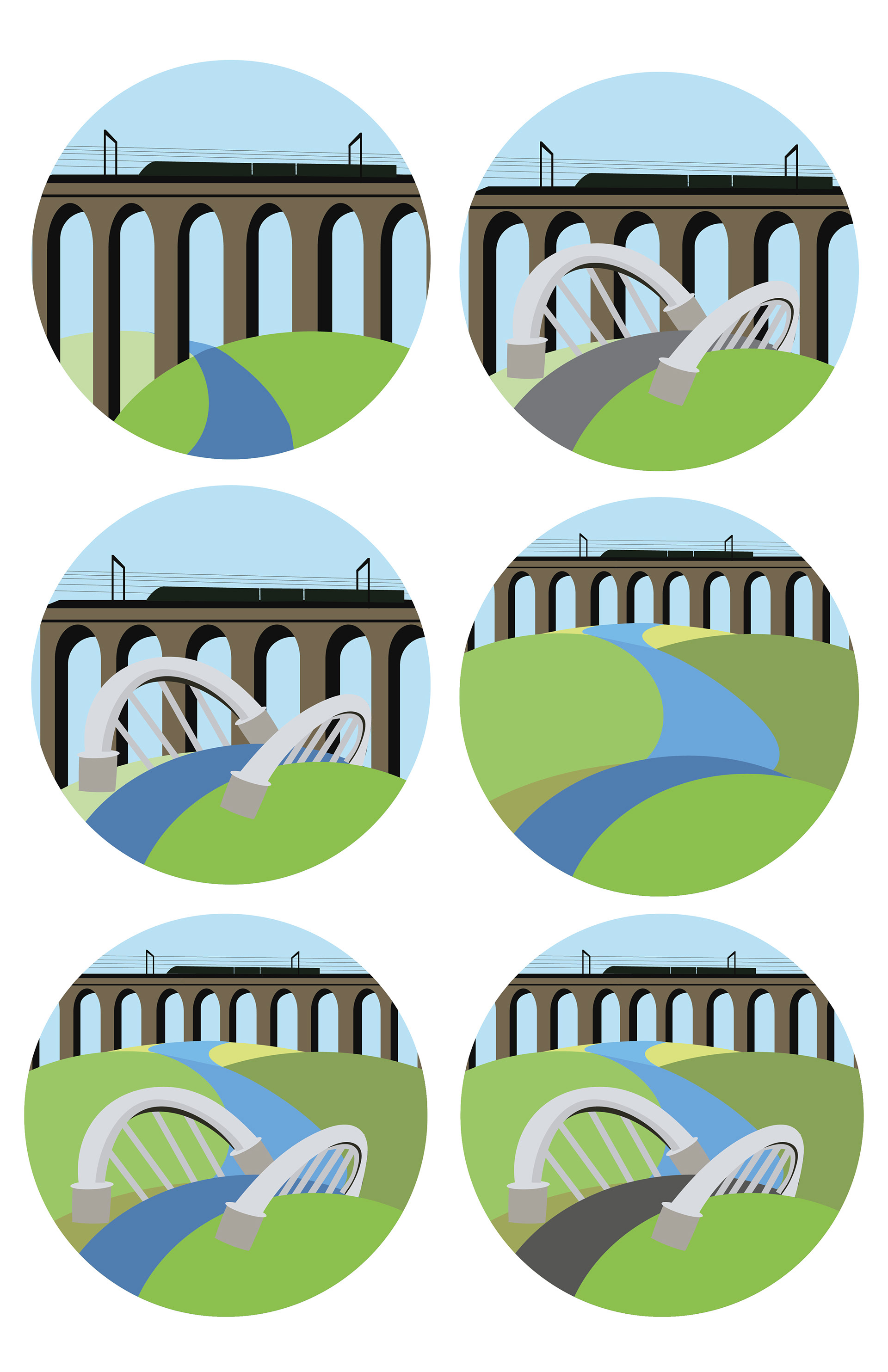
I began by making sketches that focused on the bridge and the viaduct from different perspectives. I then illustrated these designs in Adobe Illustrator. I sourced a variety of colour schemes from Google which were based on the Lesbury landscape. I wanted it to be bold, engaging and approachable to represent the community and the village shop.


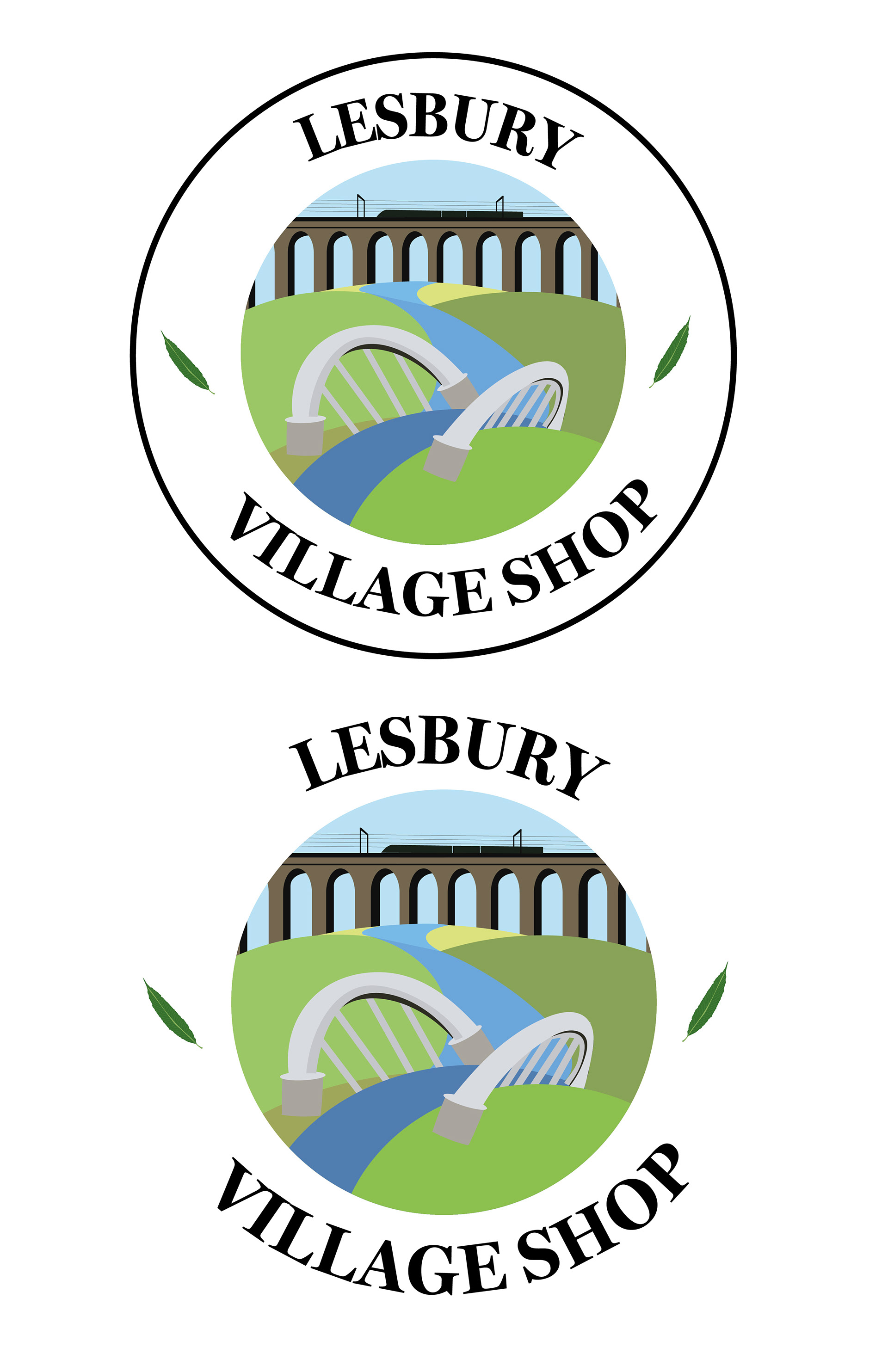
Looking at existing small business logos for inspiration, I appreciated the circular aesthetic with titles around the edges of the design. I also incorporated leaves from the Willow tree that can be seen in the village.


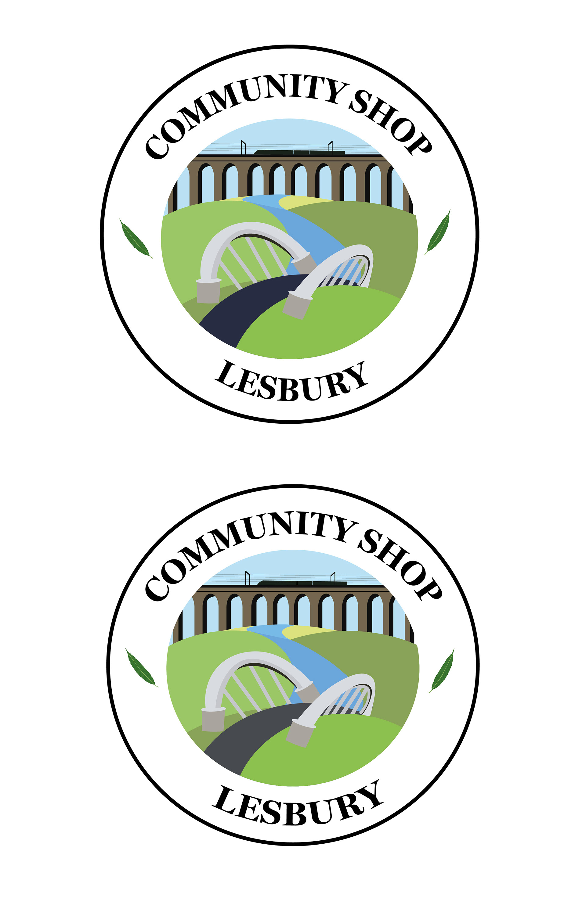
Receiving feedback from the client I was asked to explore the road in different colours. I considered making it look like the River Ale and changing it to different shades of blue, as well as making it grey and dark grey to symbolise the road leading to Alnwick. I was also asked to explore different name variations and try a version without any borders. Below is the final design that has been selected for the village shop.
After completing the brand identity I was informed that the community wanted to use the logo to represent the village. I am honoured to have my logo visible as you enter Lesbury.