This project involved designing a brand identity and a set of brand guidelines for a new Social Enterprise Network company in Newcastle. The client also wanted prototypes and mockups for a new website that included a database sharing the different social enterprises in Newcastle. The client provided a list of resources which discussed what existing social enterprises and organisations wanted from the website and what should be considered when I had to design the brand identity. The website design can be found under 'NSEN Website Design' in the UX / UI Design section.
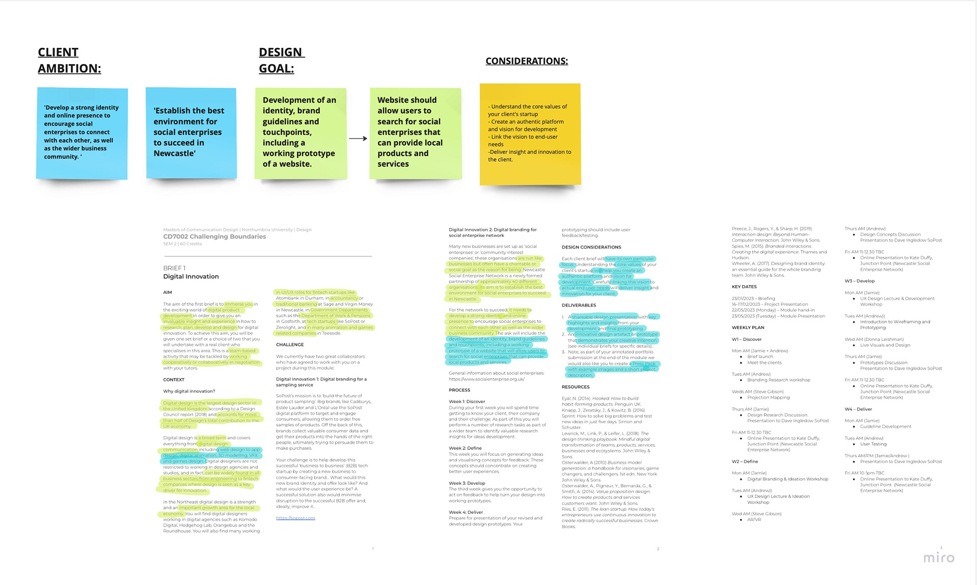
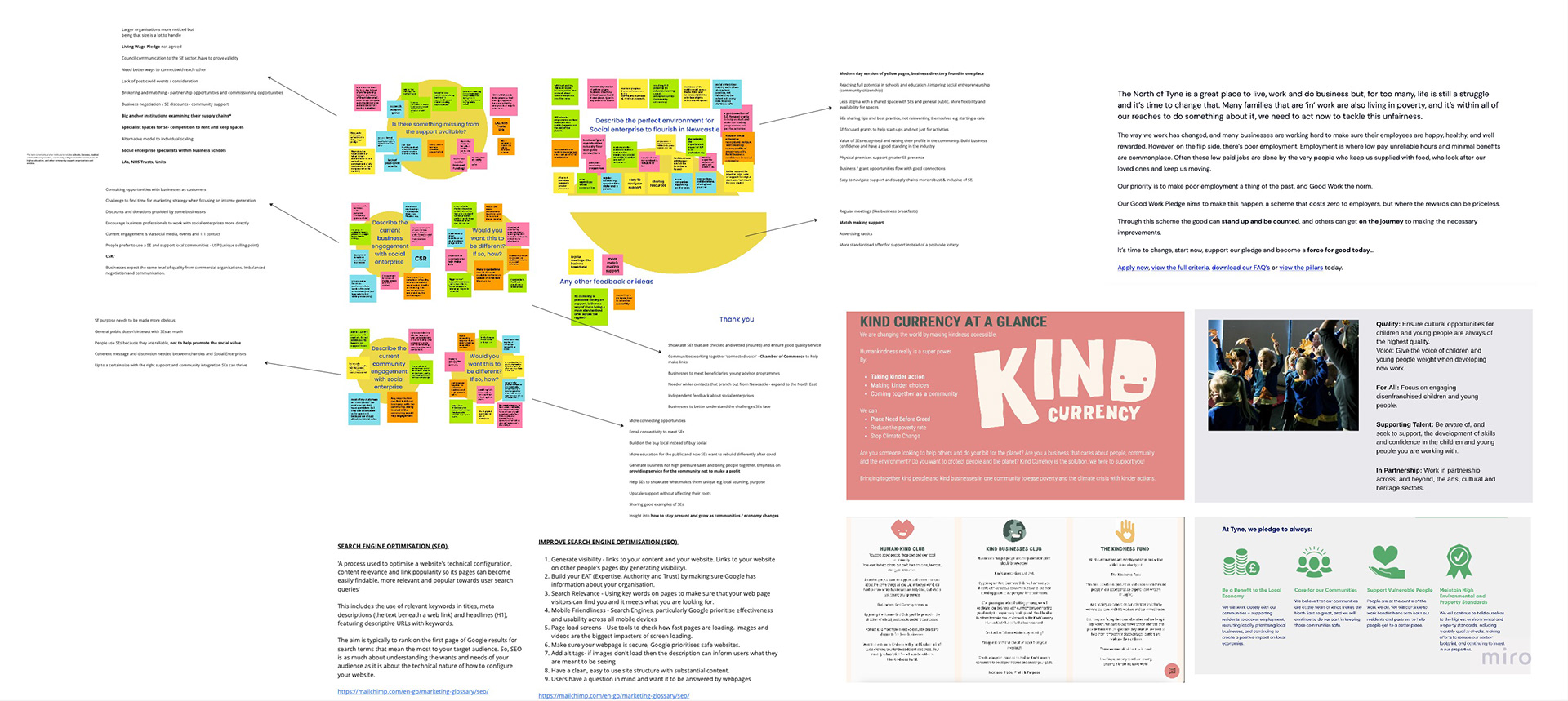
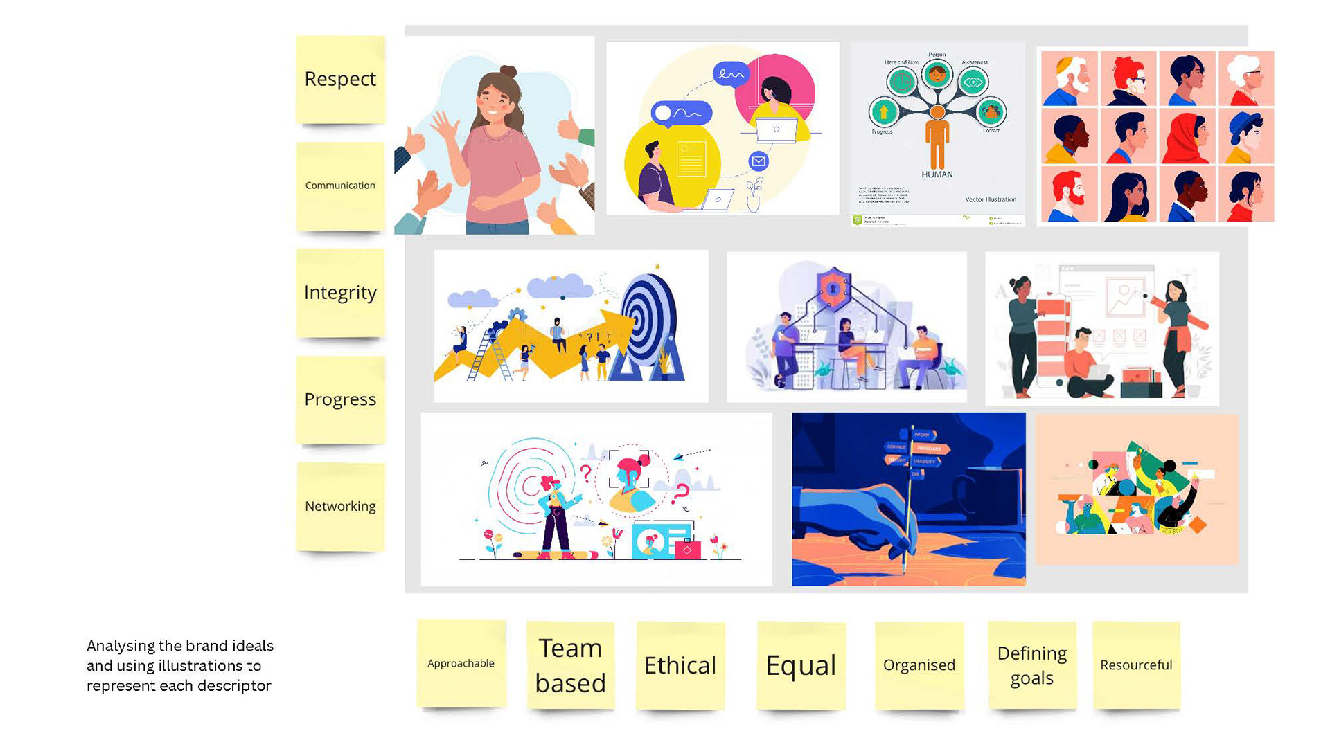
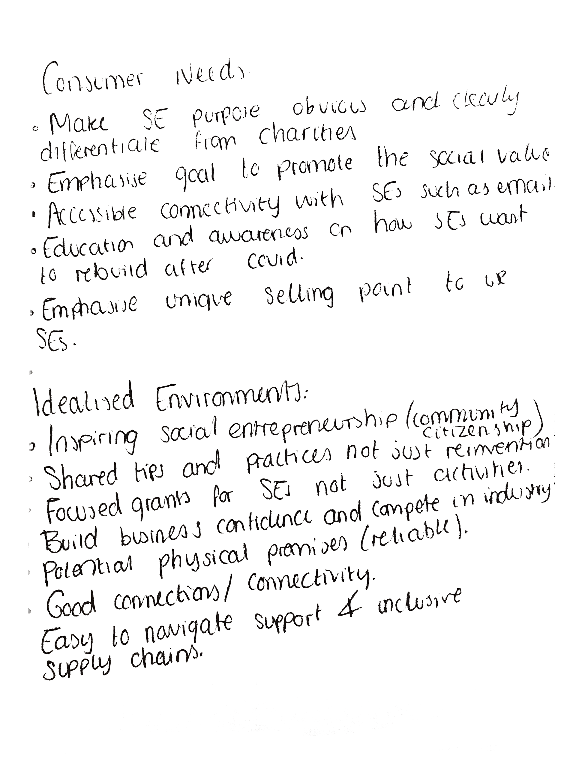

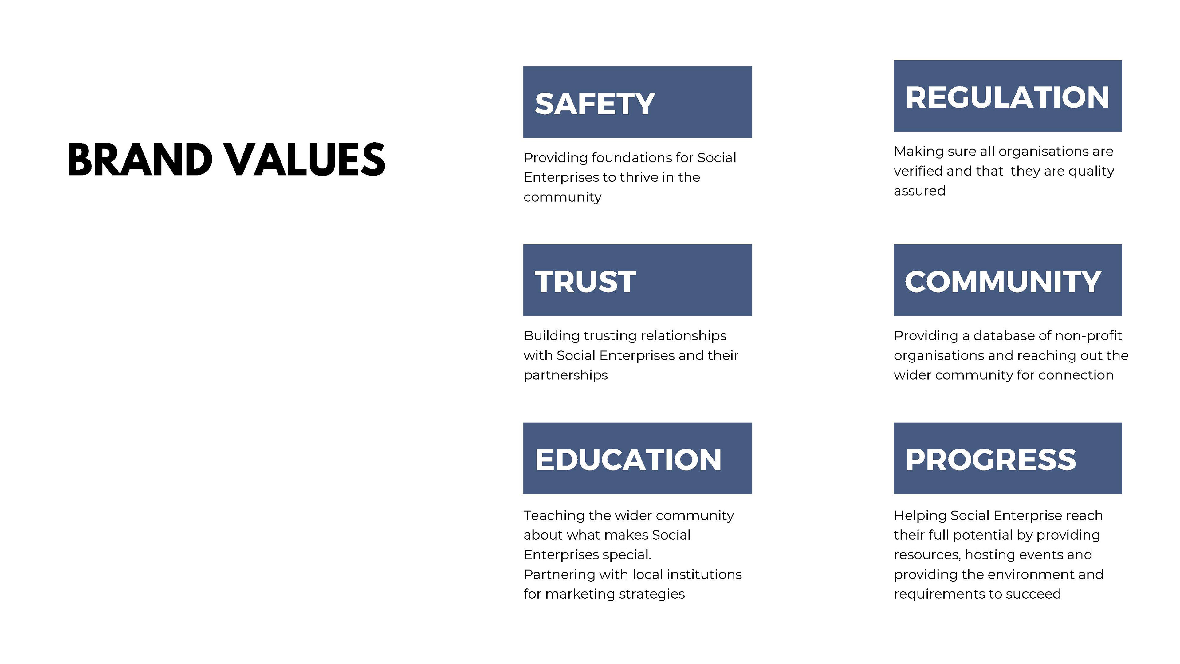
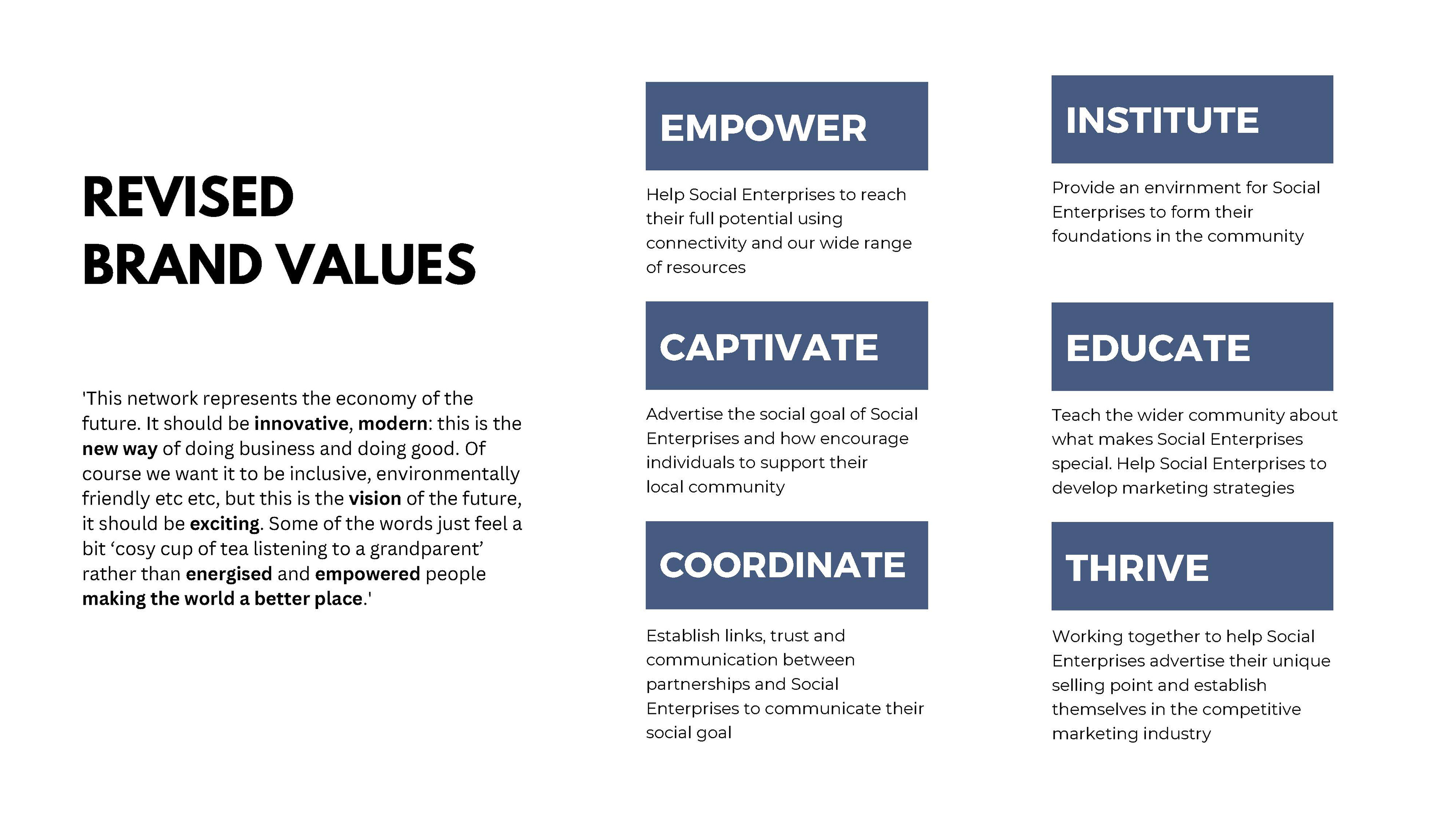
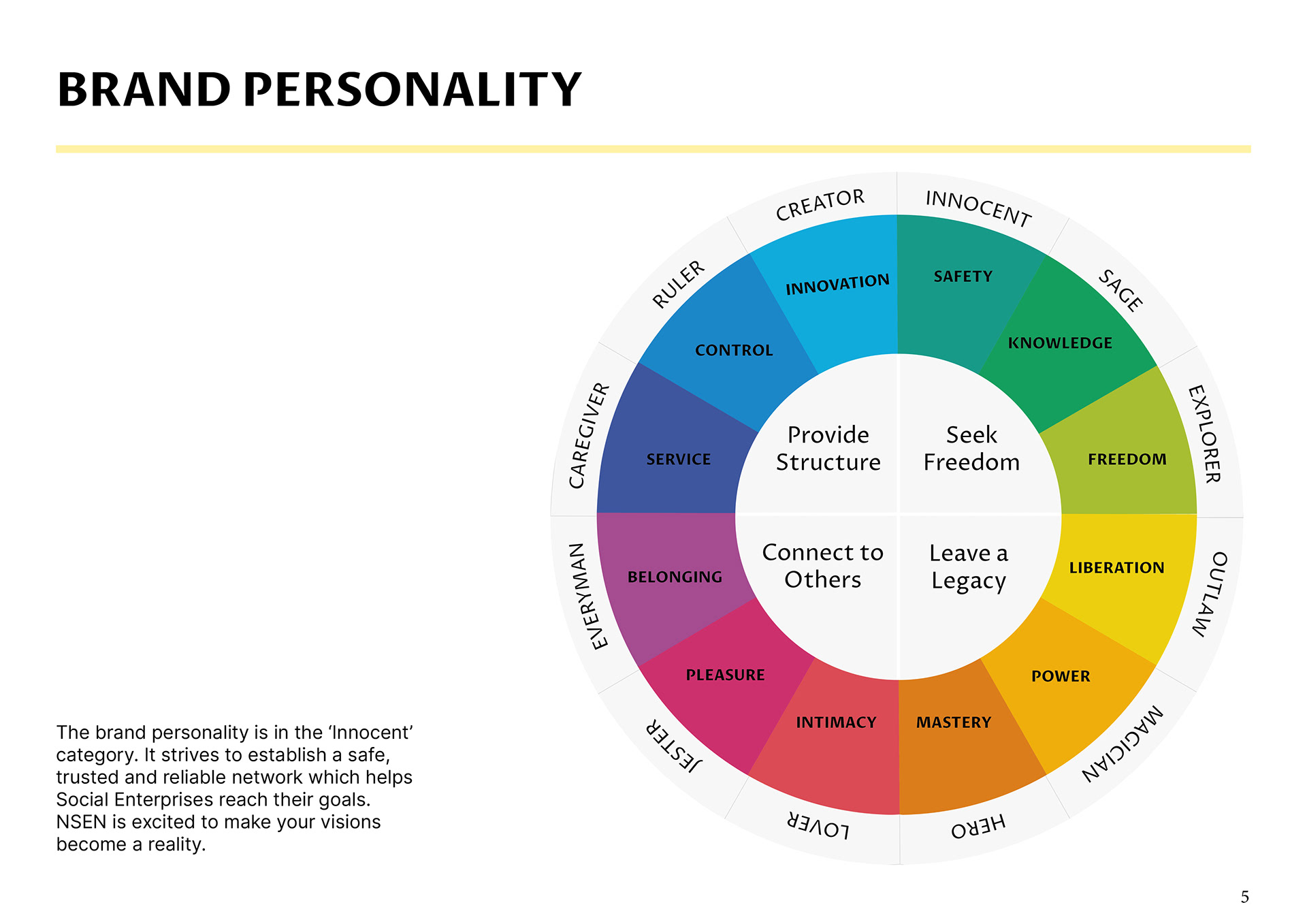
I started this project by speaking with the client and identifying what they wanted their brand to represent. This was a brand new company who wanted a brand identity and a set of brand guidelines for their new website.
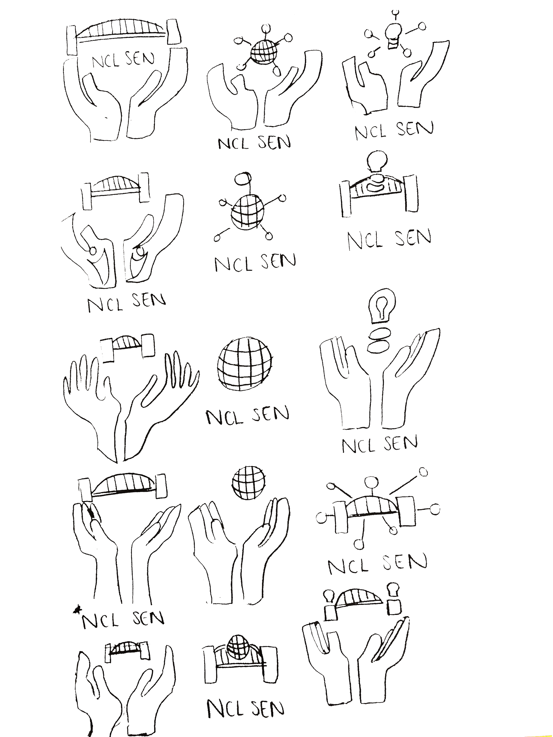
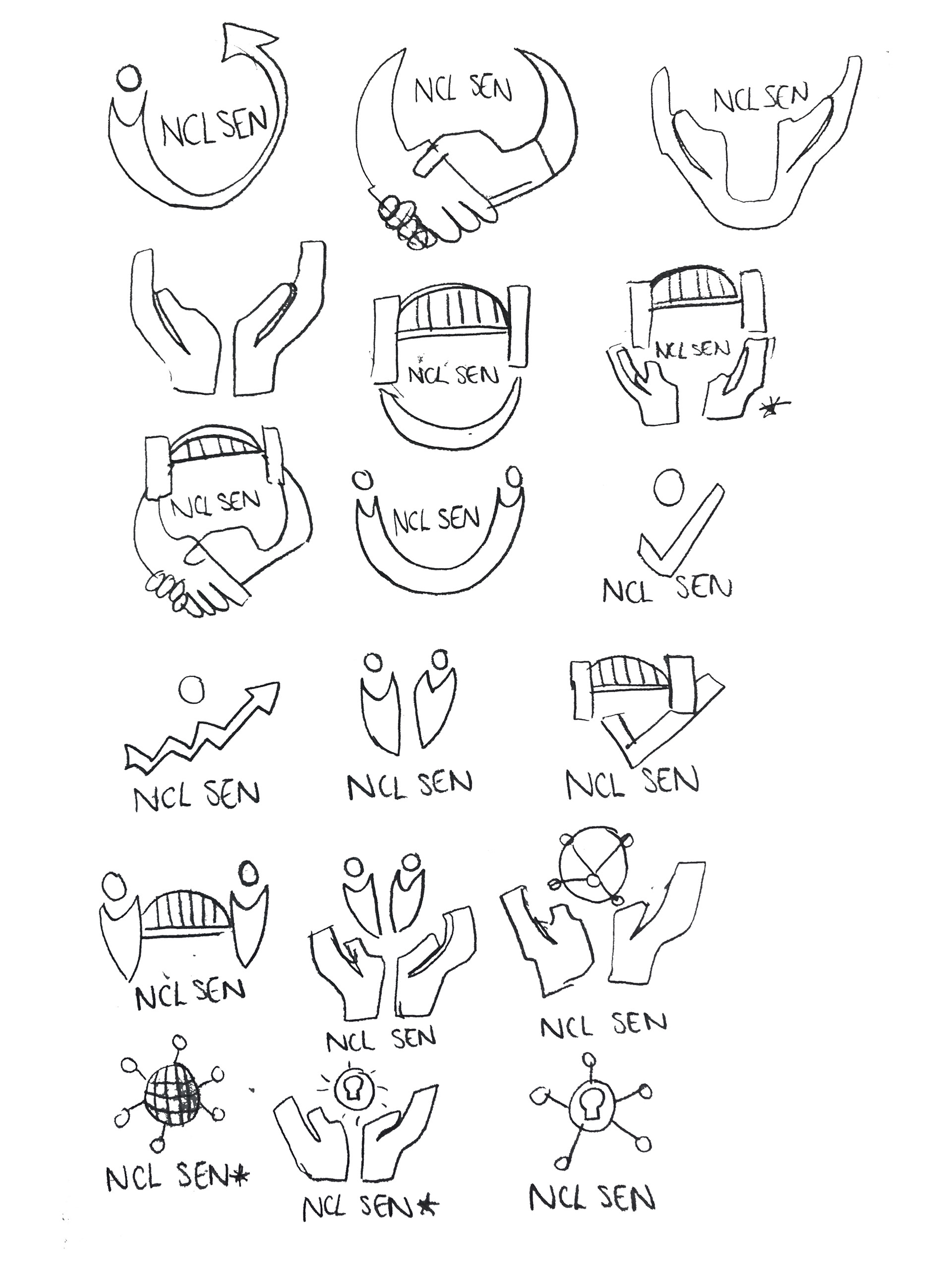
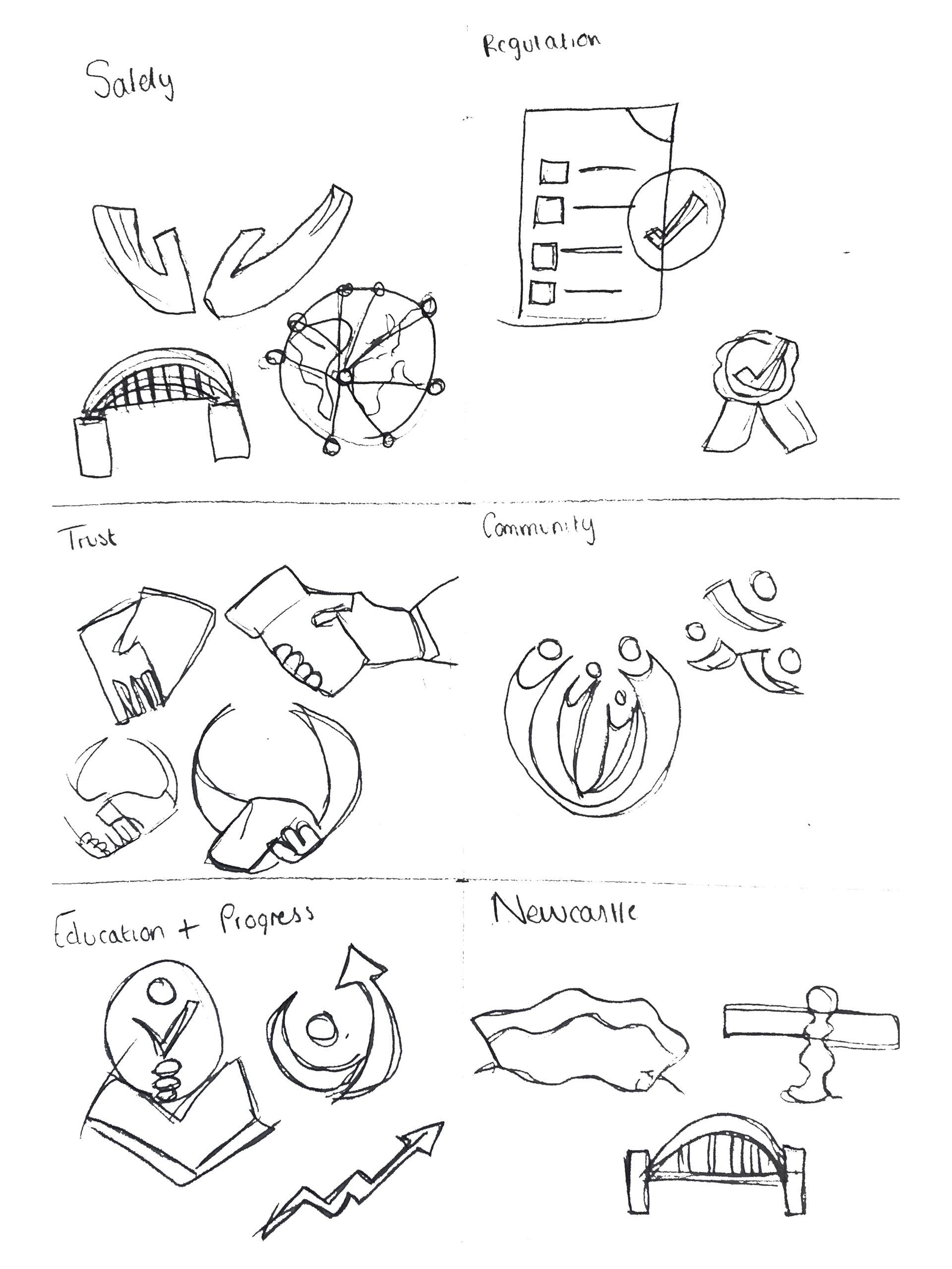
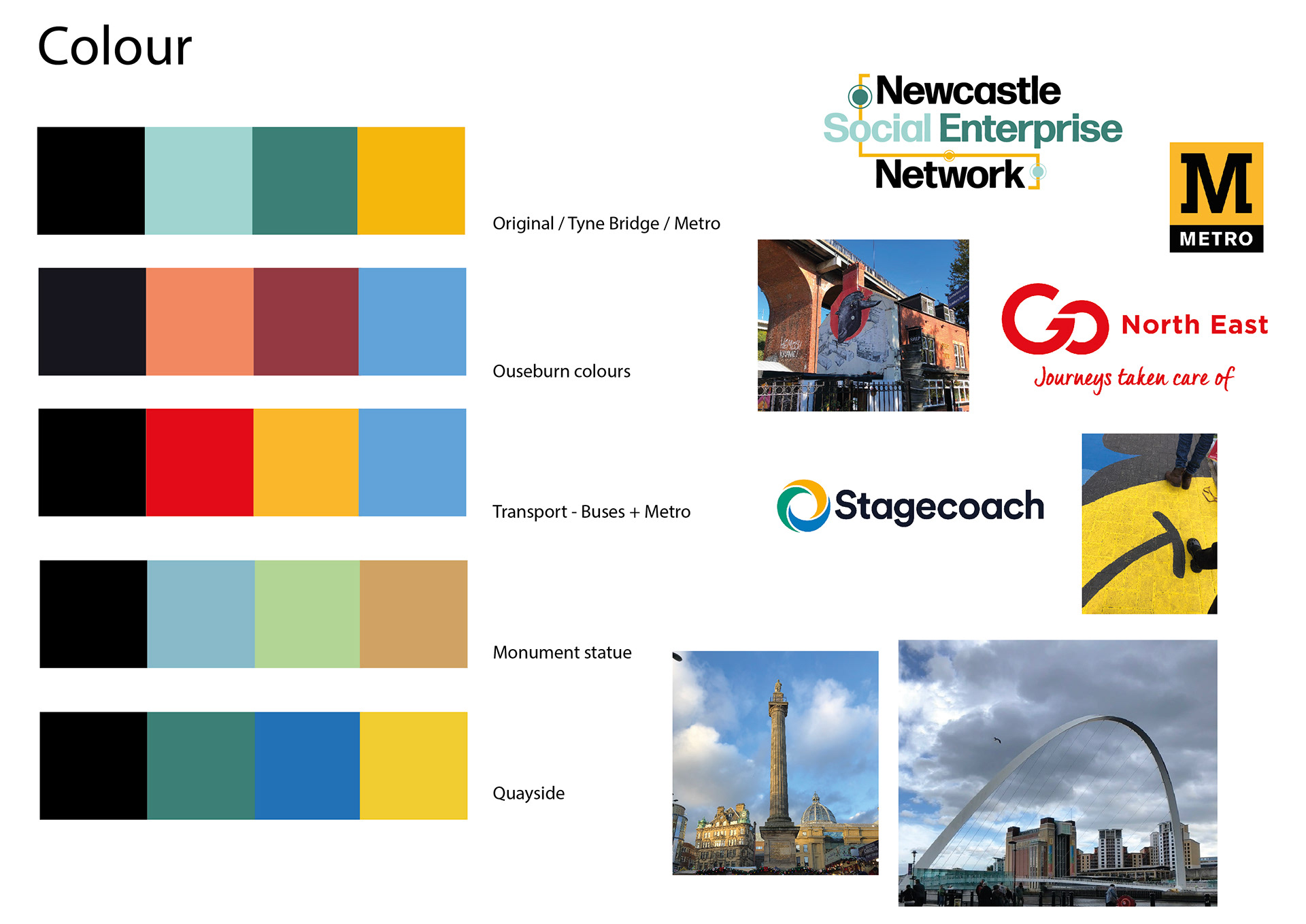
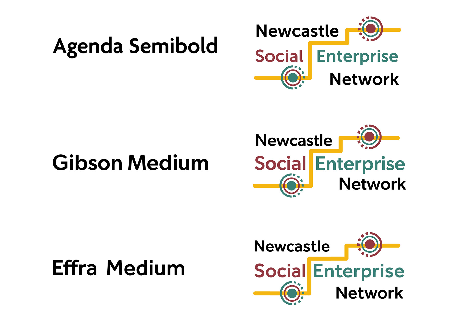
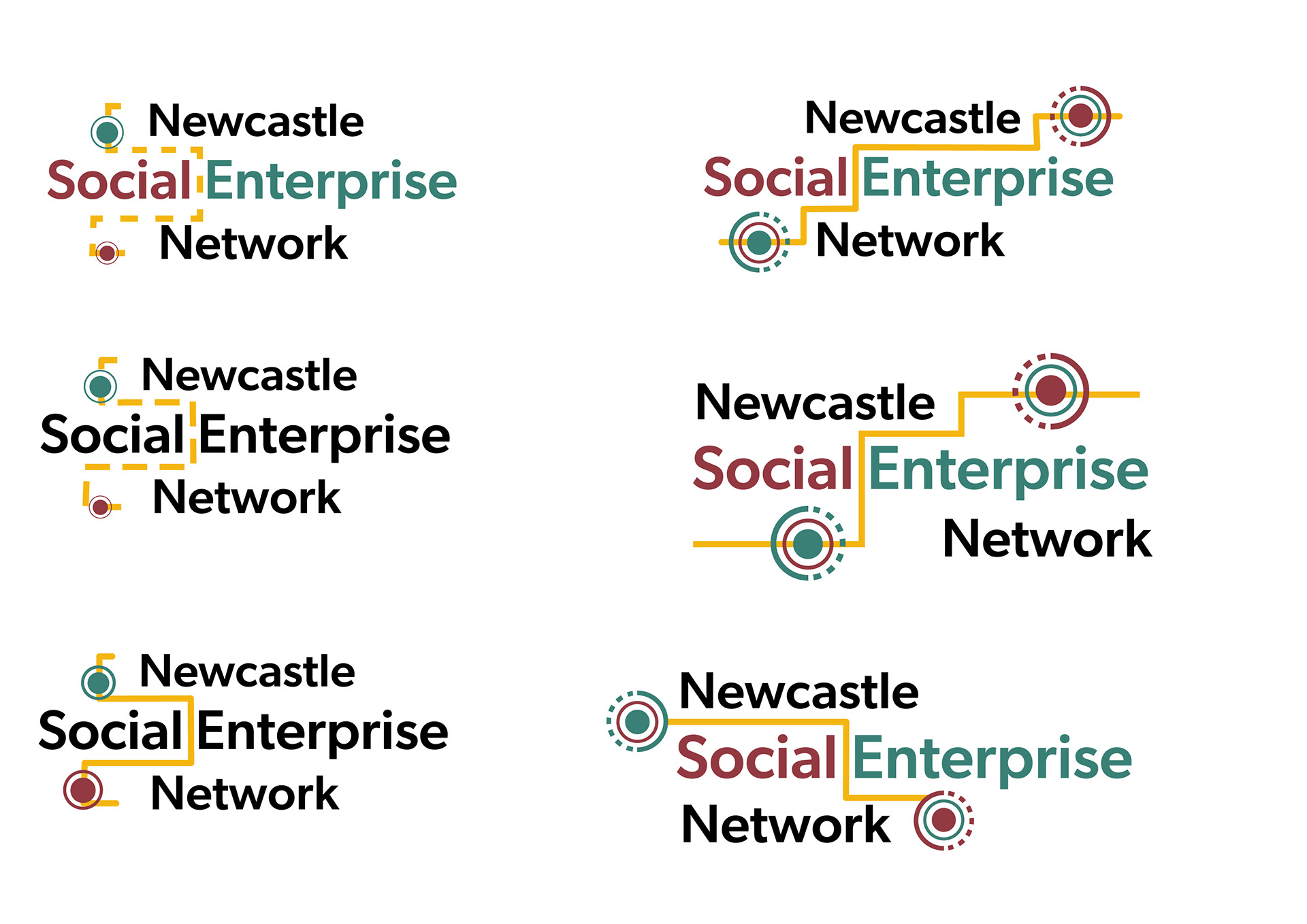
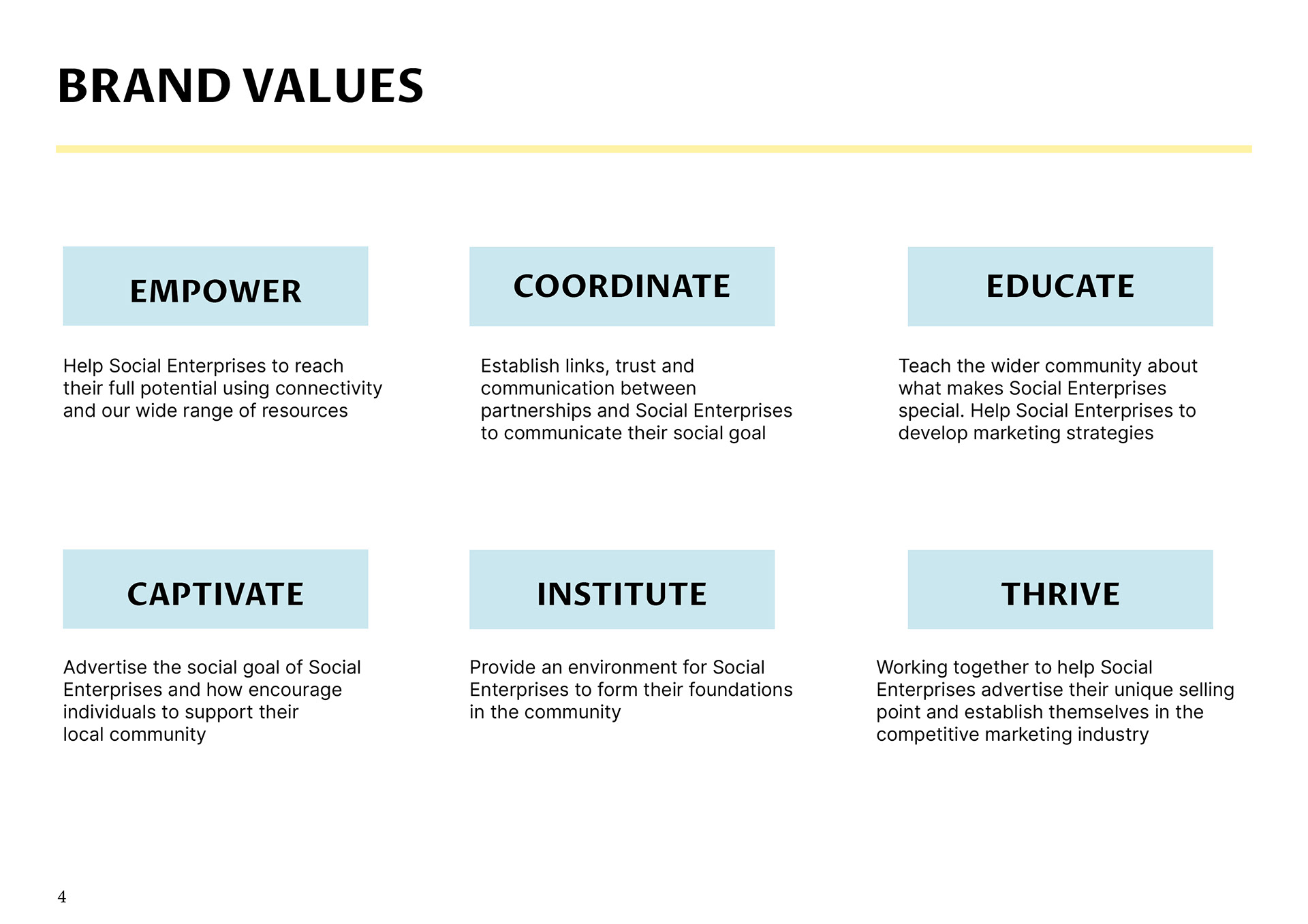
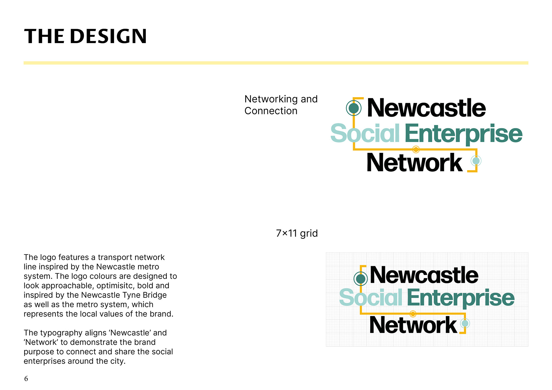
Based on the core values I designed a series of logo ideas inspired by connection, the Newcastle tyne bridge, networking and progress.


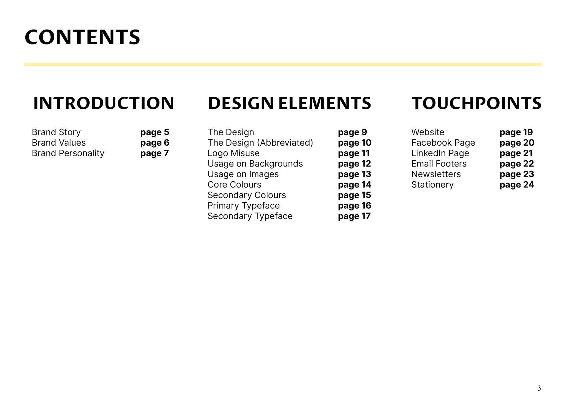

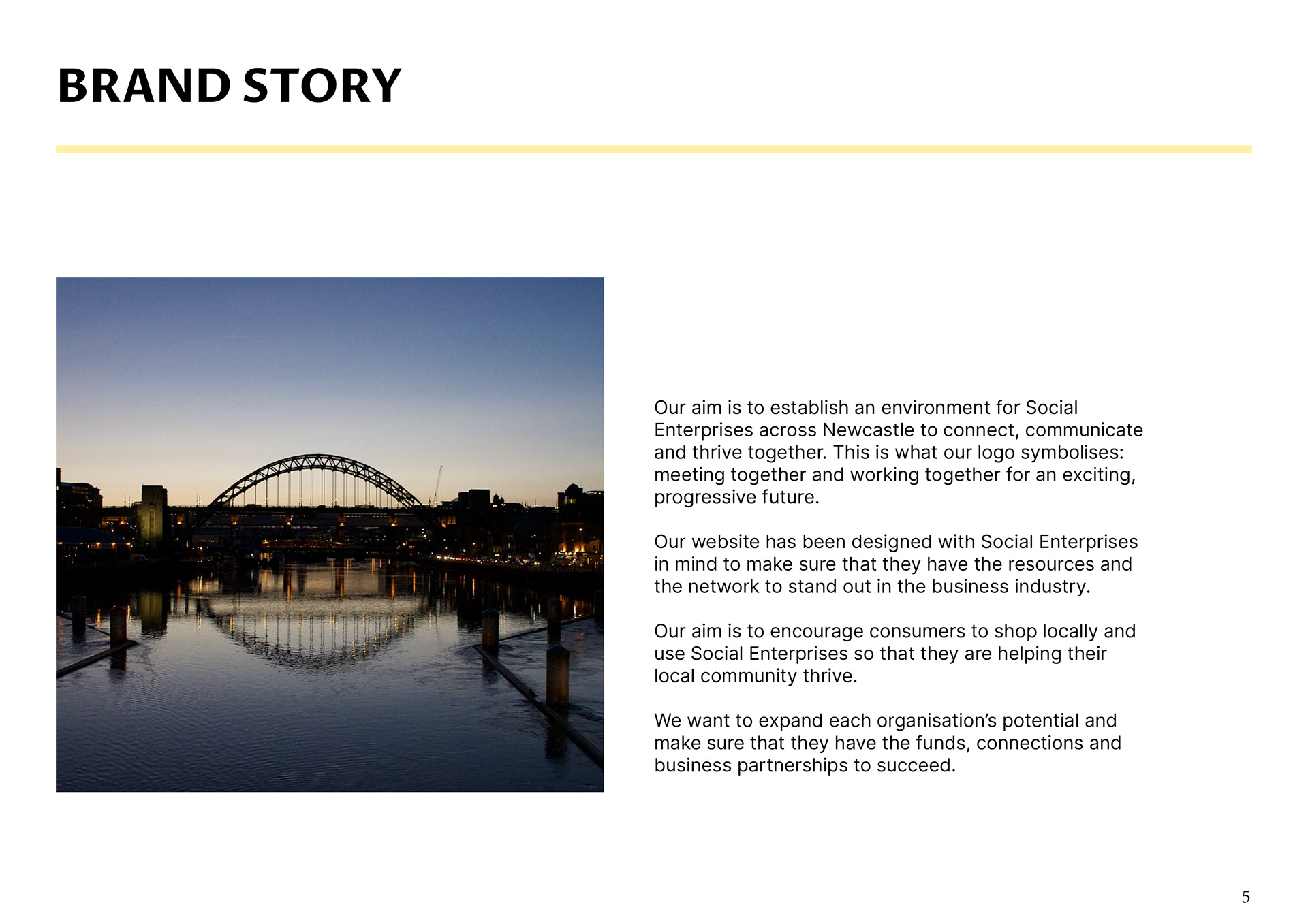

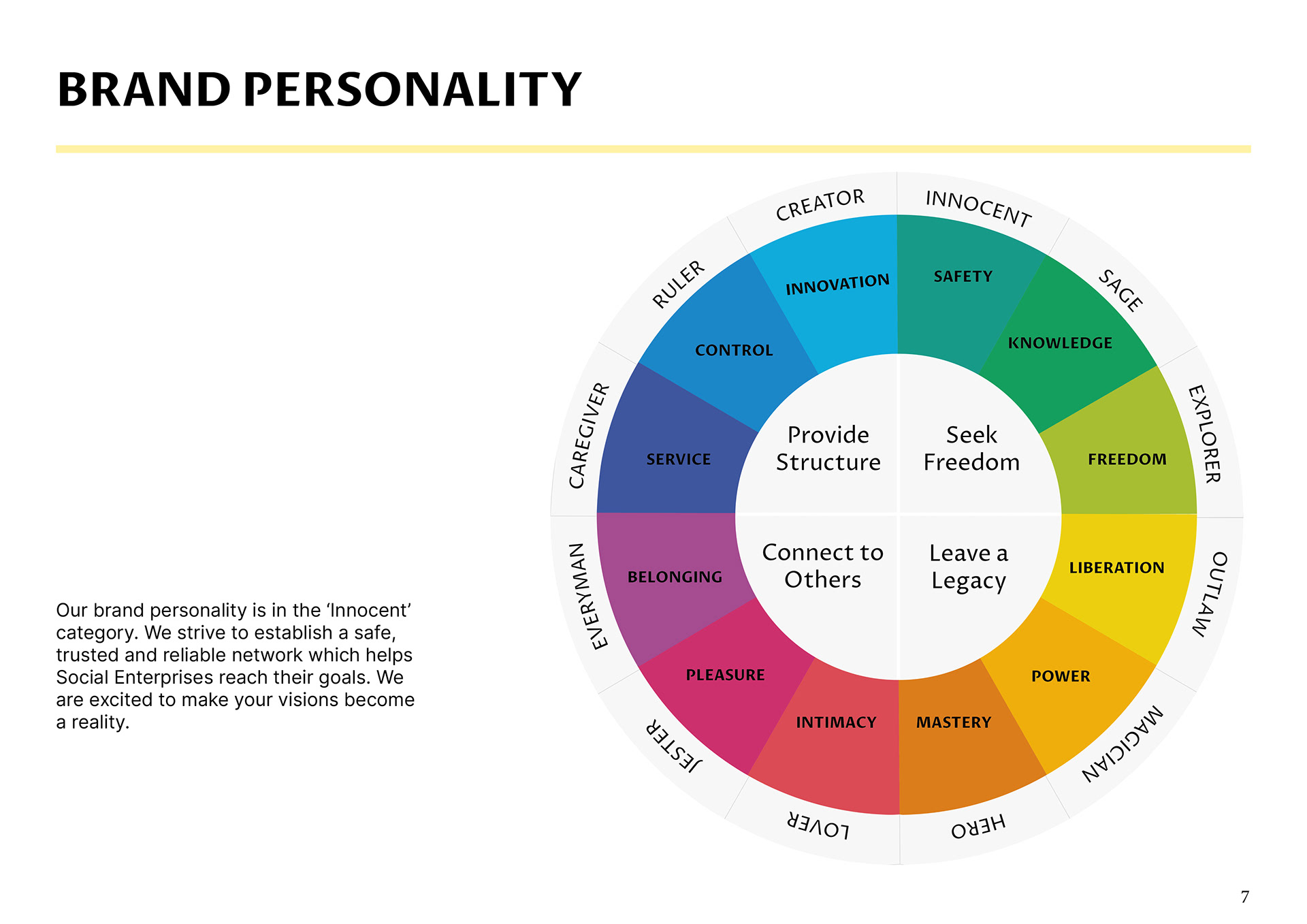

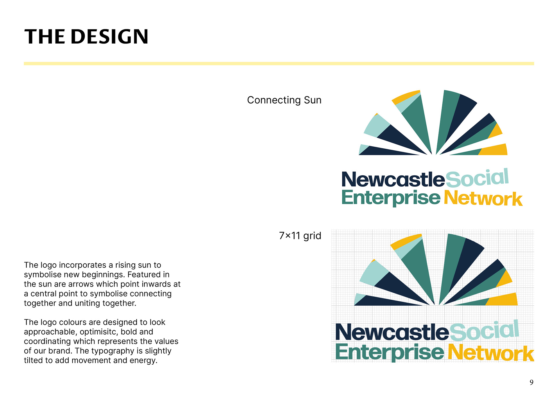
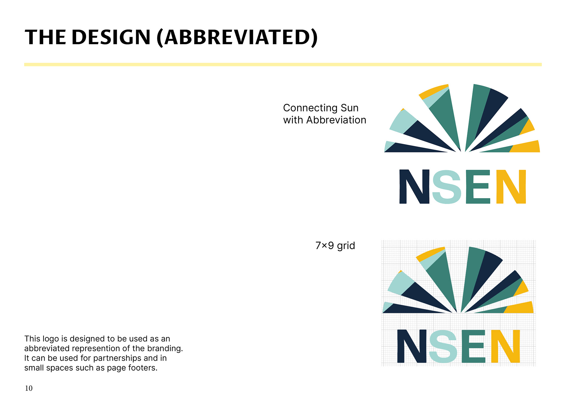
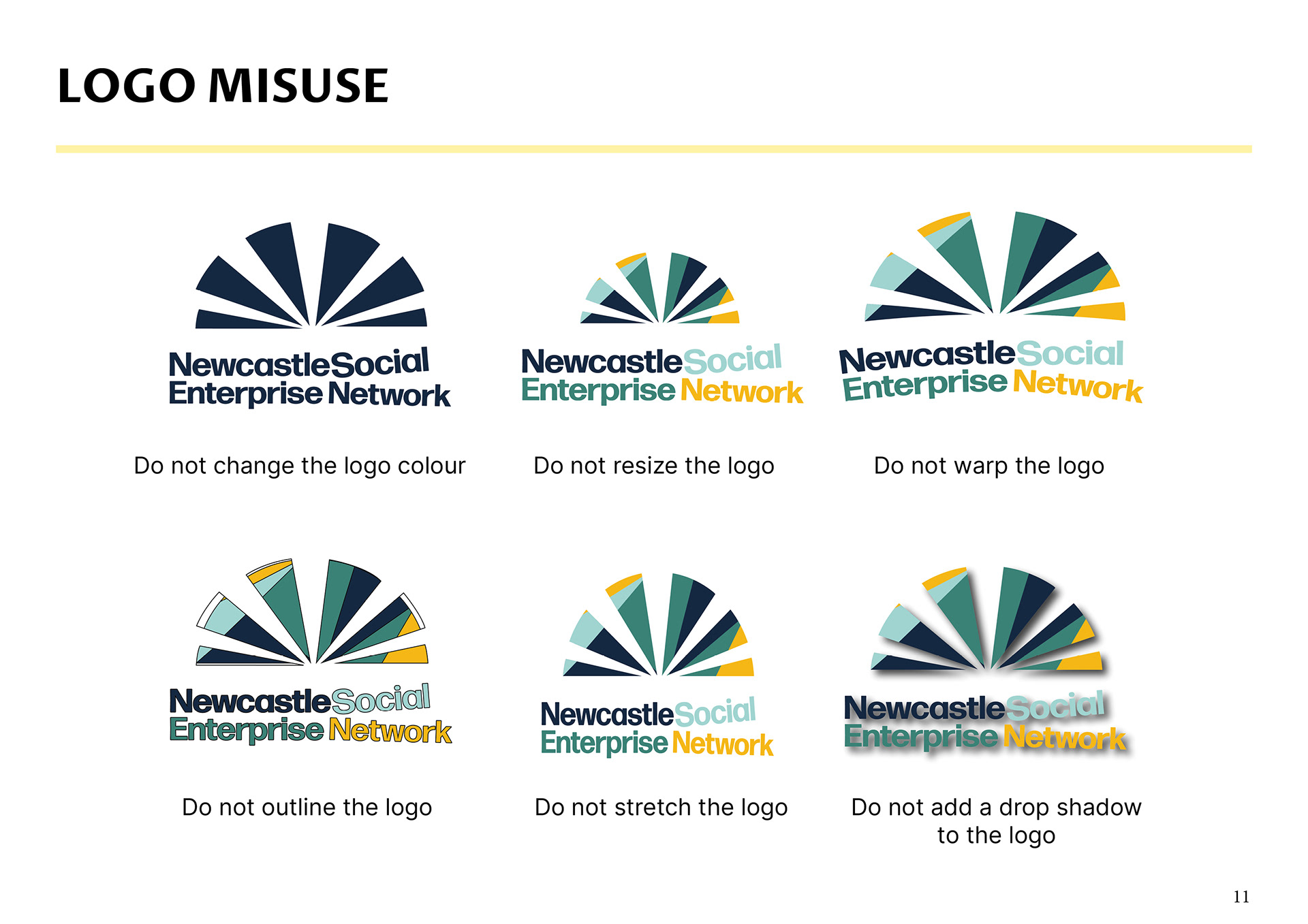
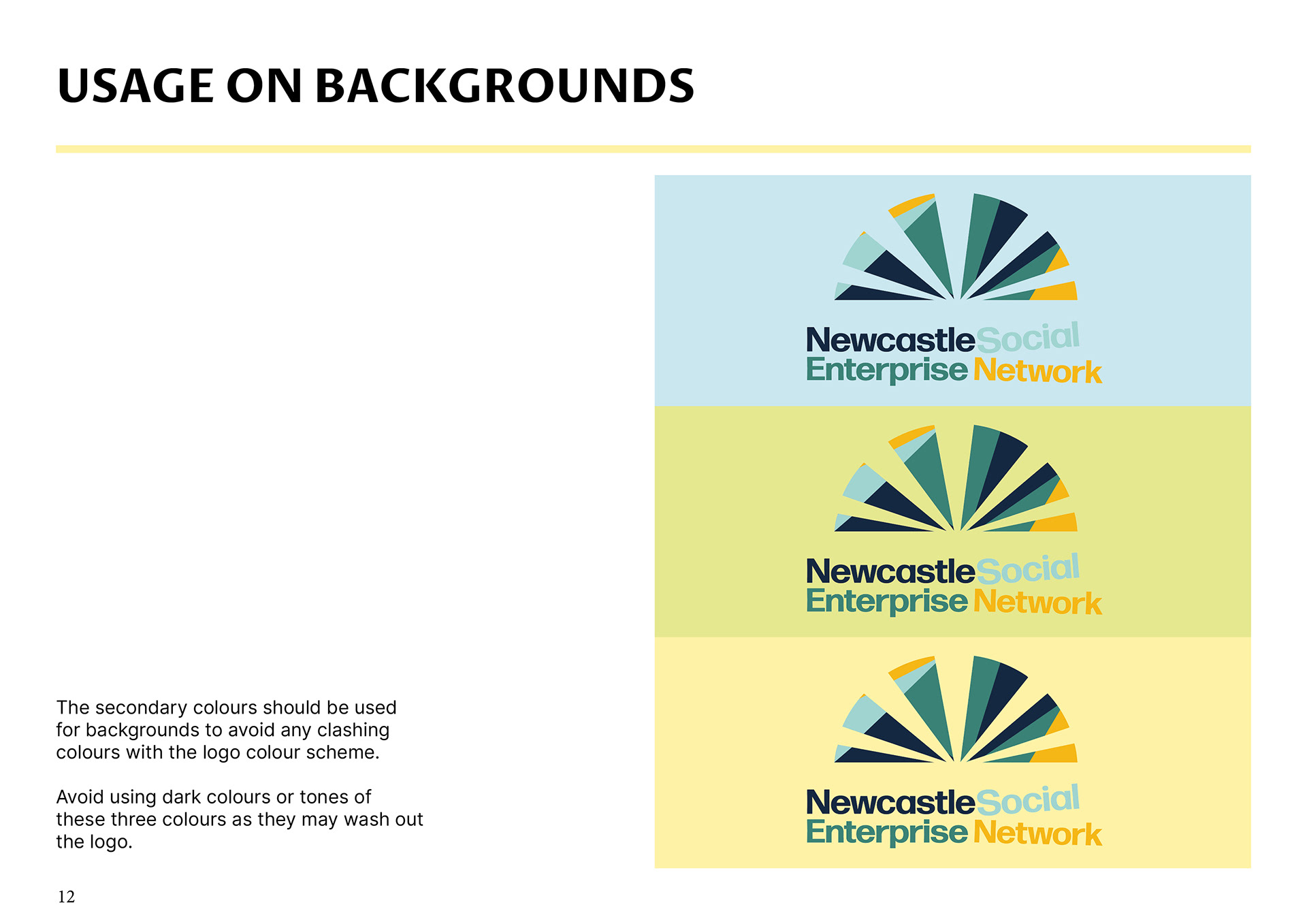
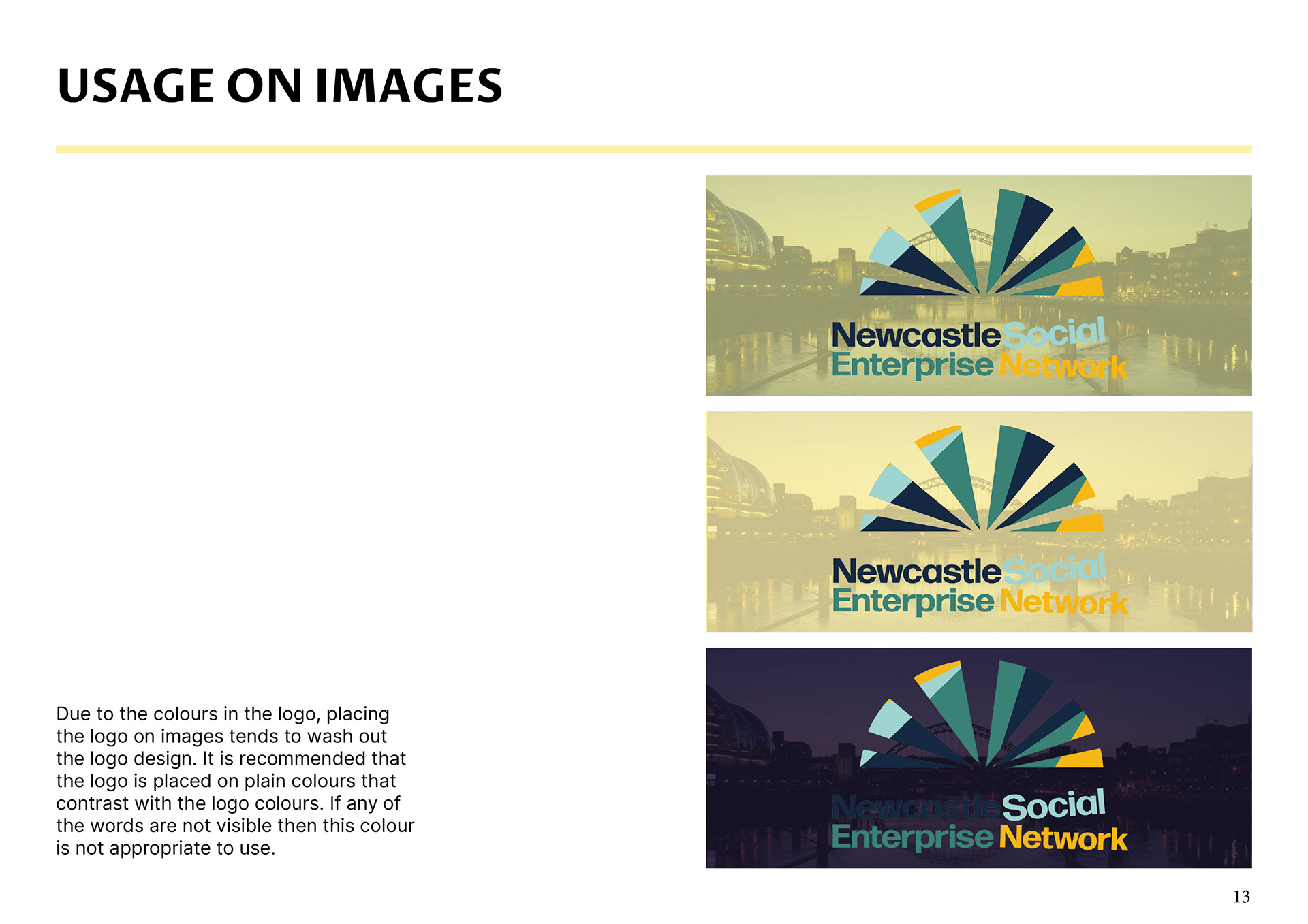
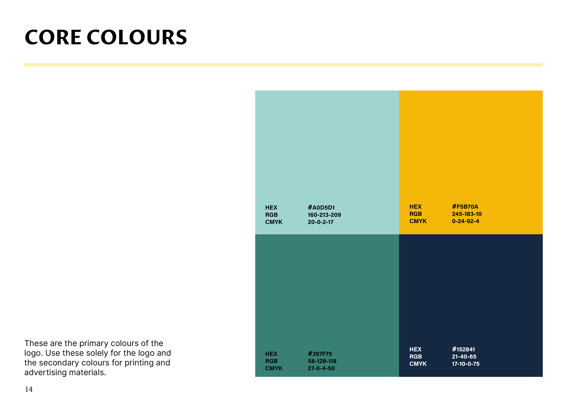
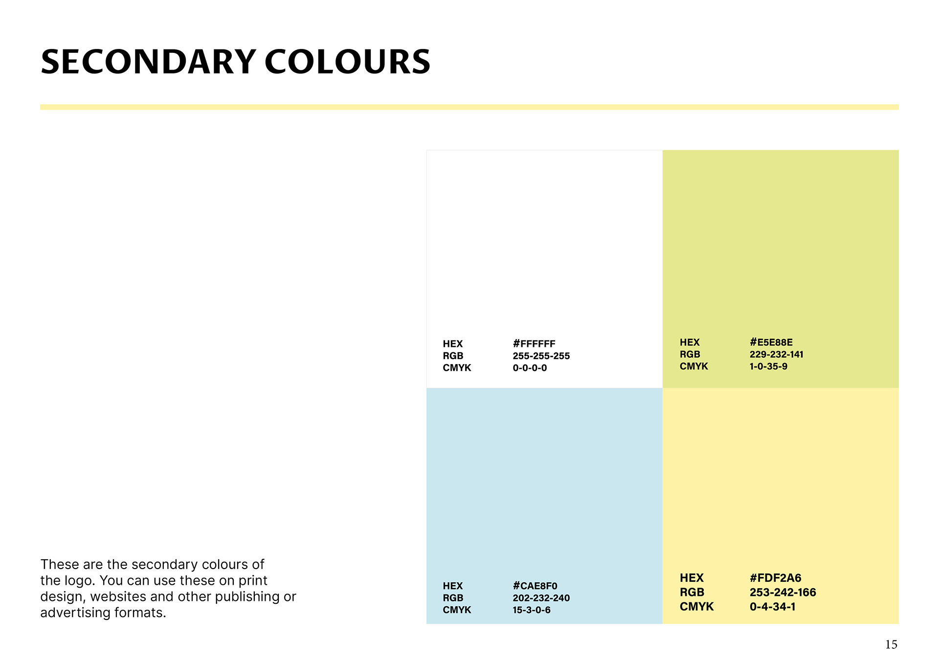
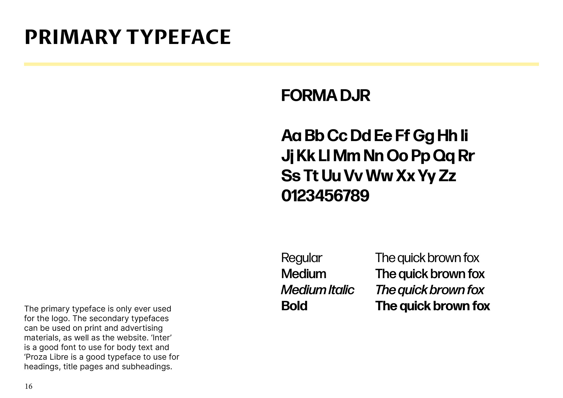
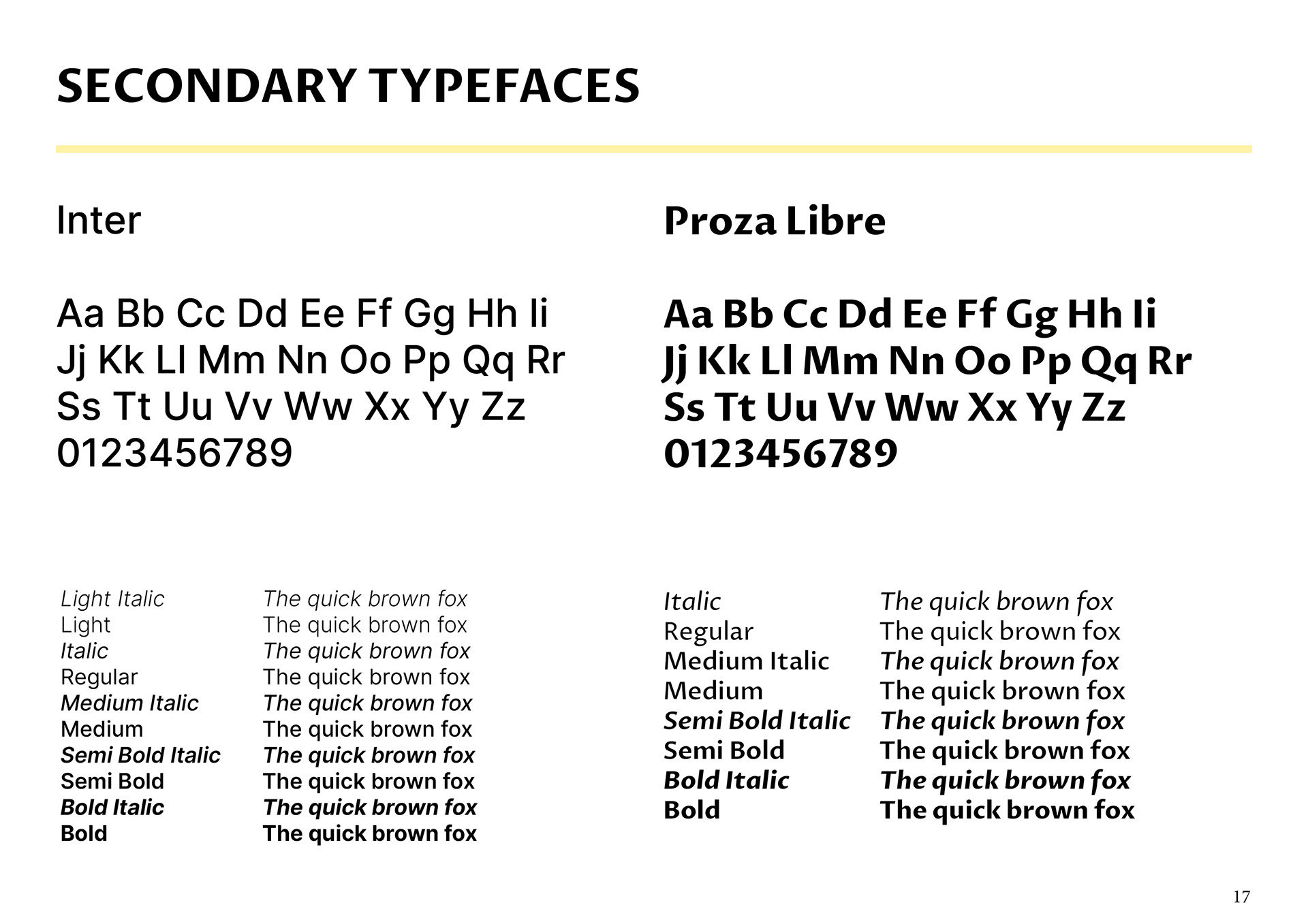

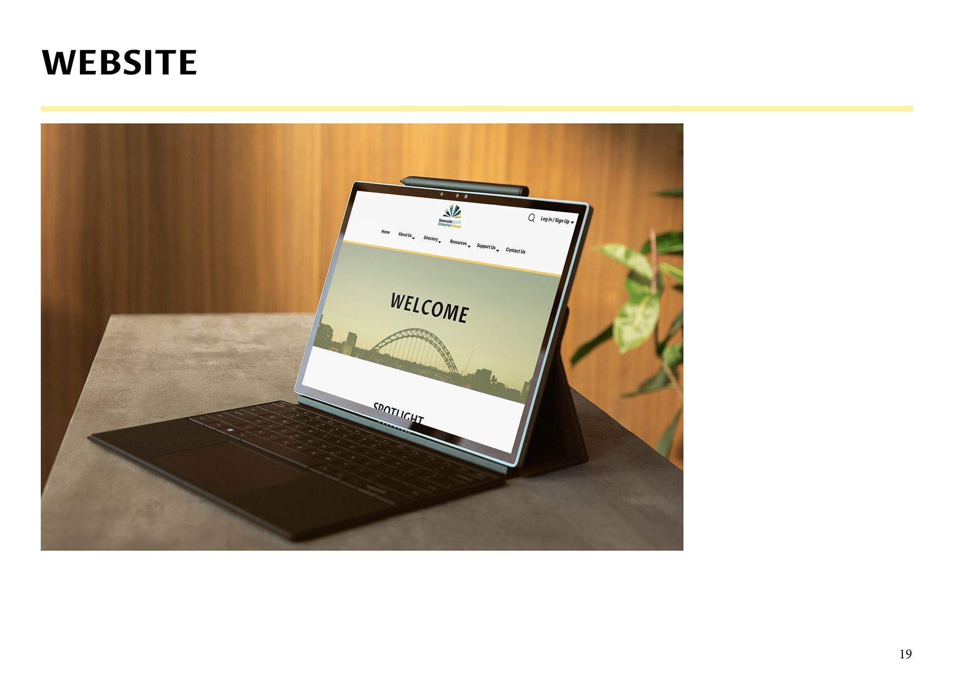
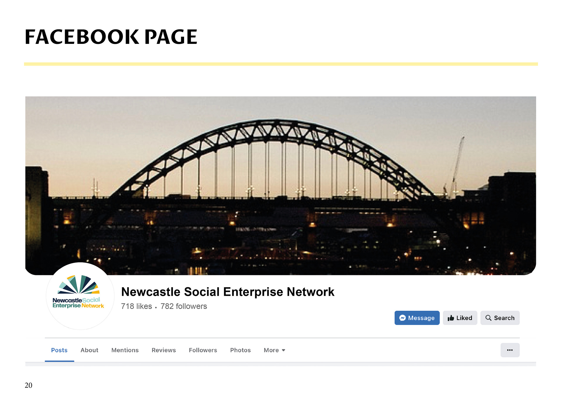
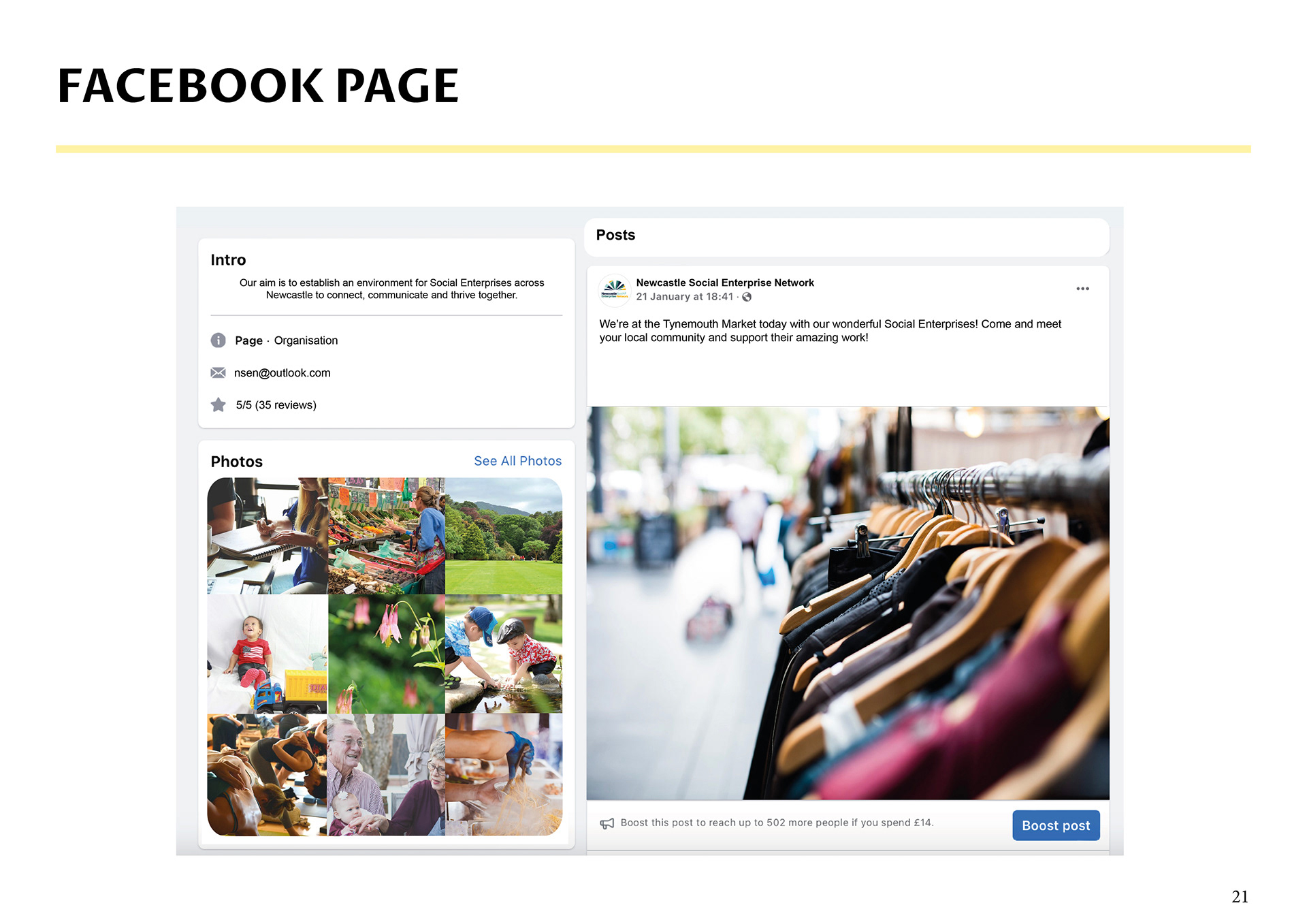
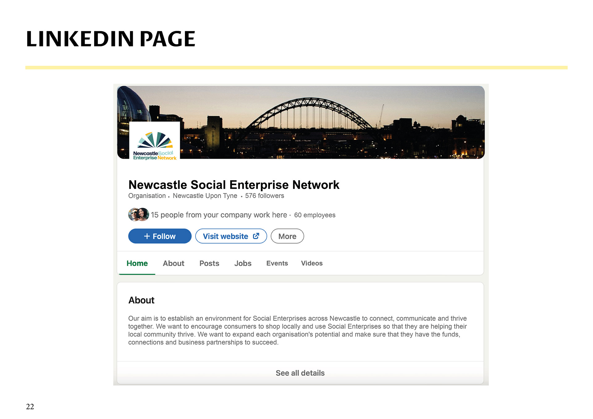
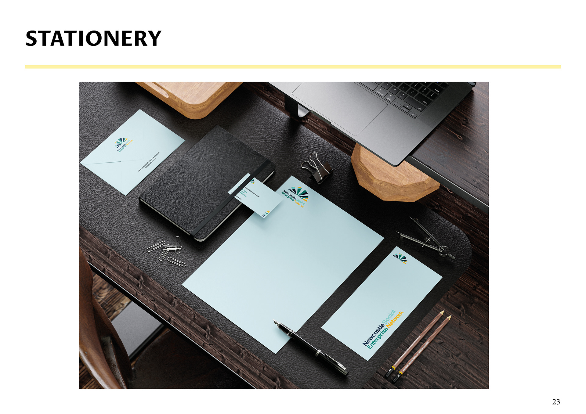

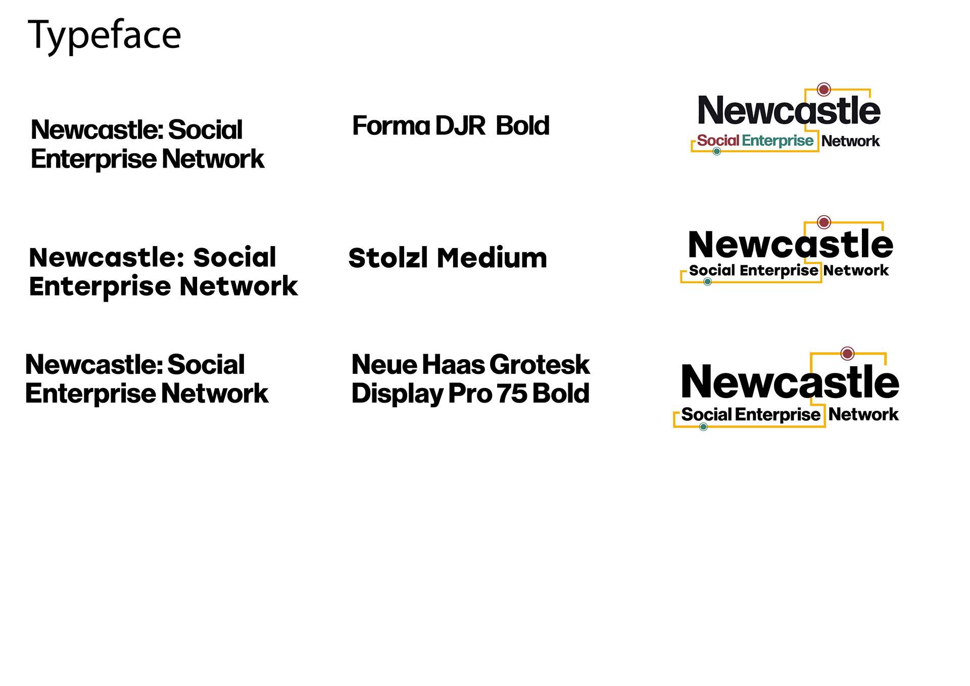
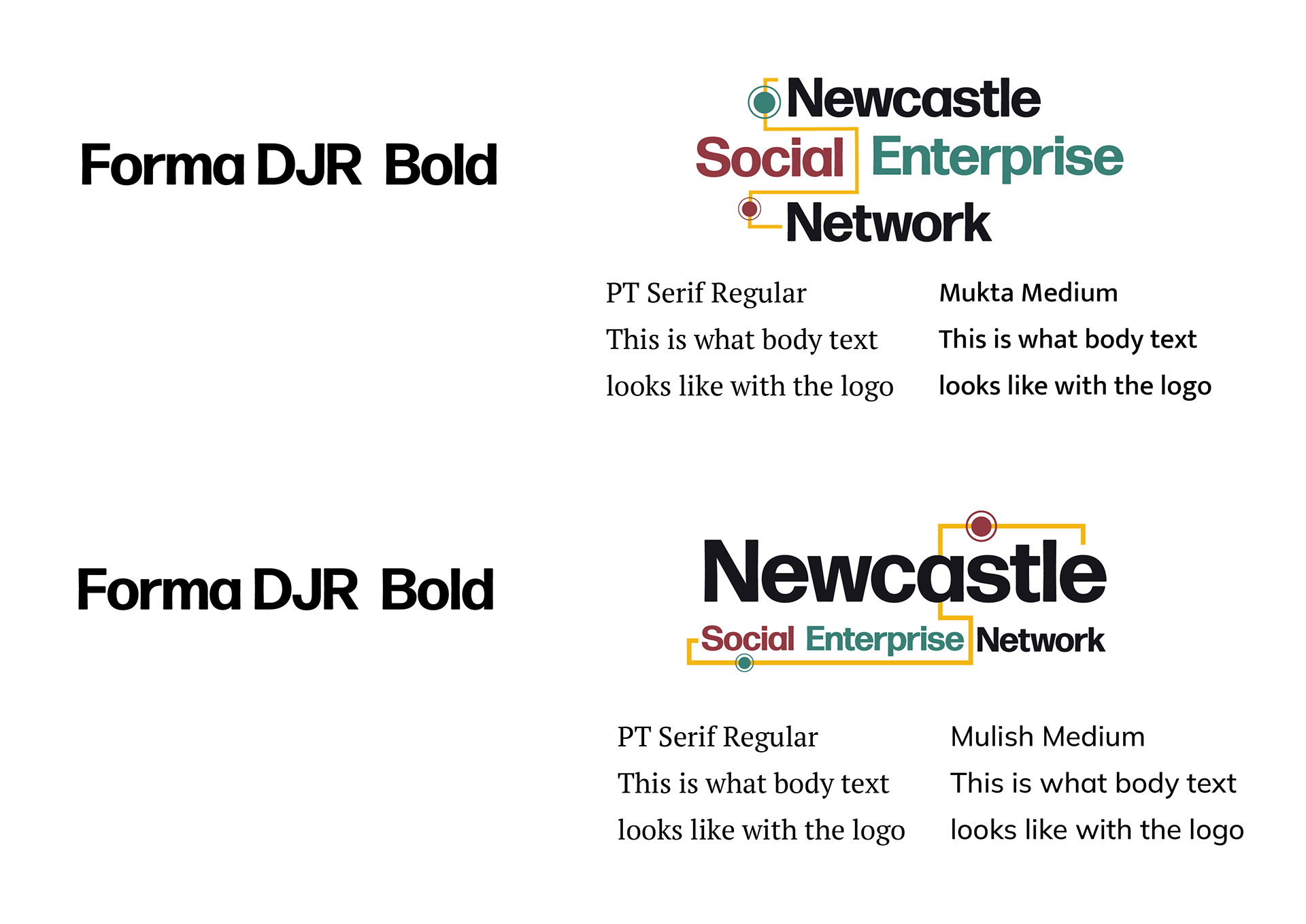
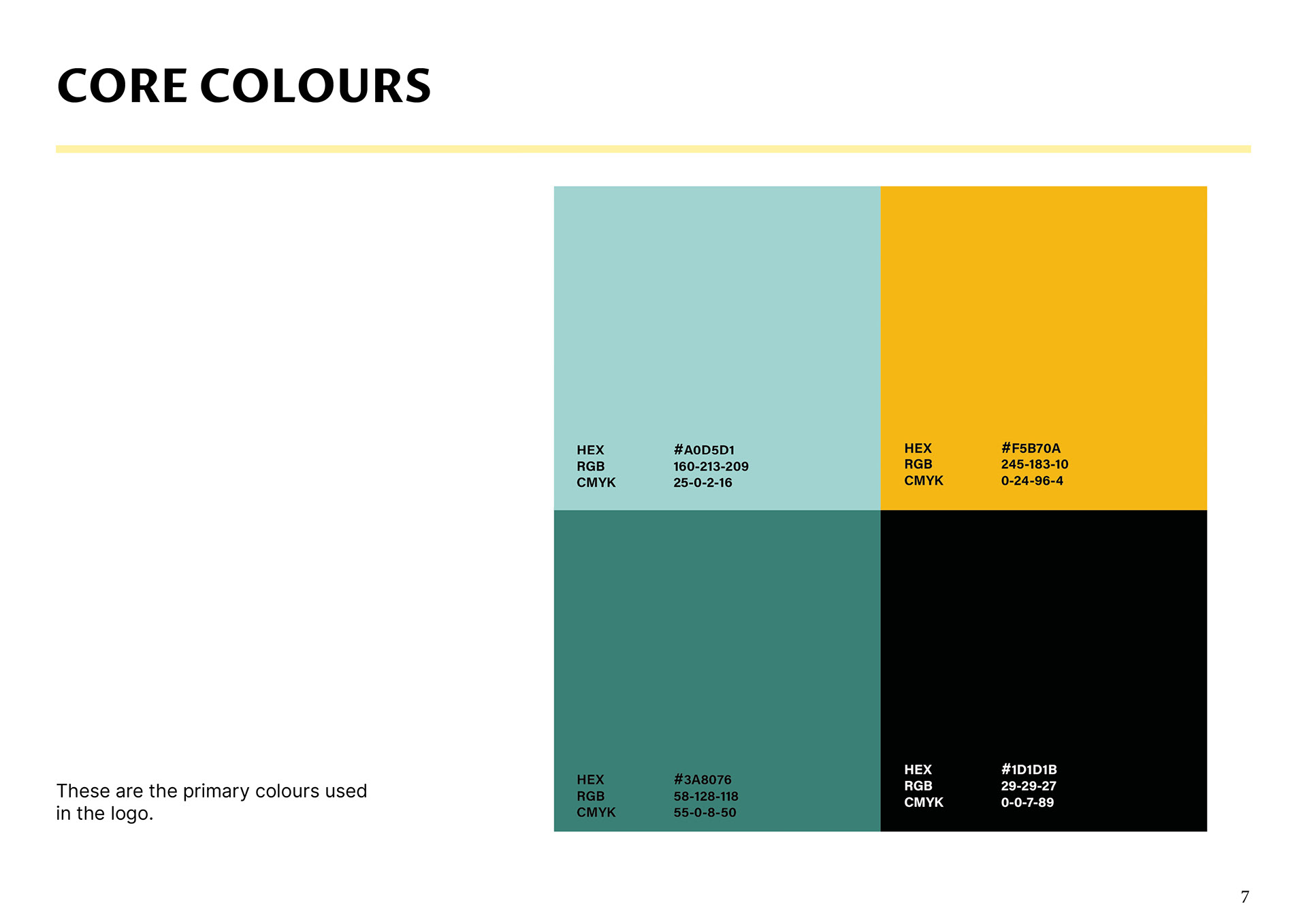
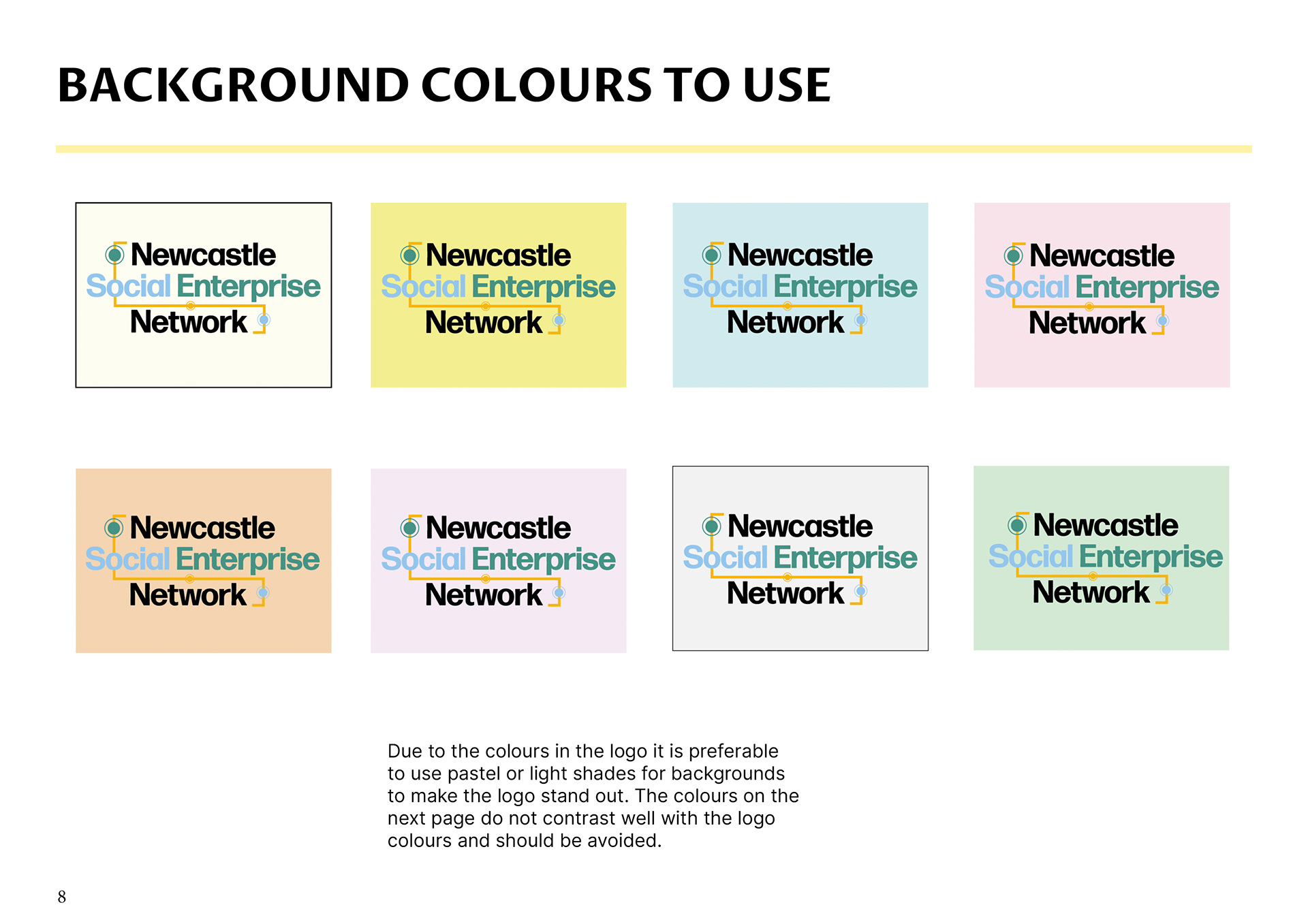
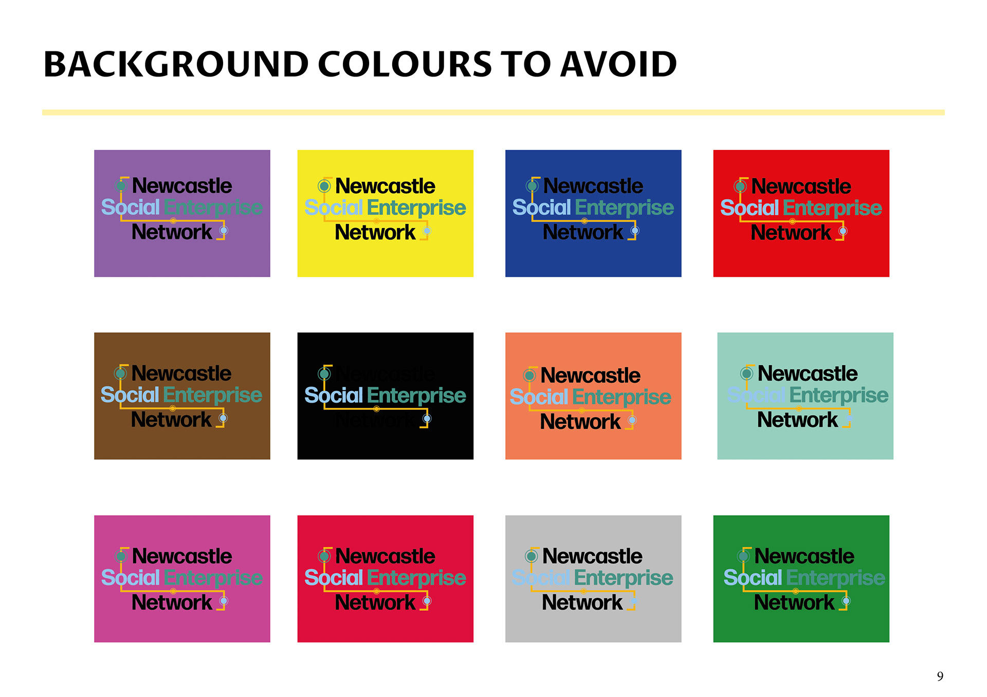
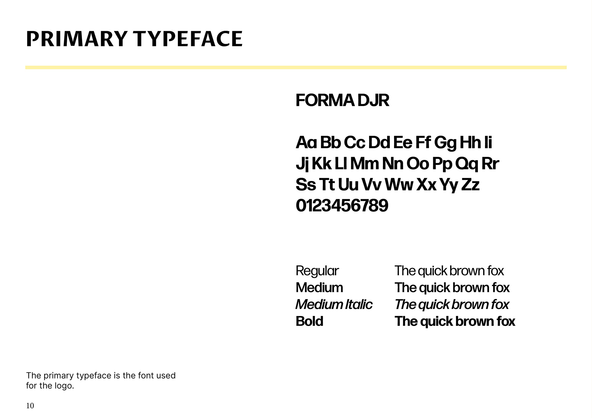
In the brand guidelines I included methods of using the logo appropriately, what font was used to create the identity, how to use the identity on different backgrounds, as well as a range of touch-points to demonstrate the brand as a merchandise or online venture.
NSEN LOGO REVISED
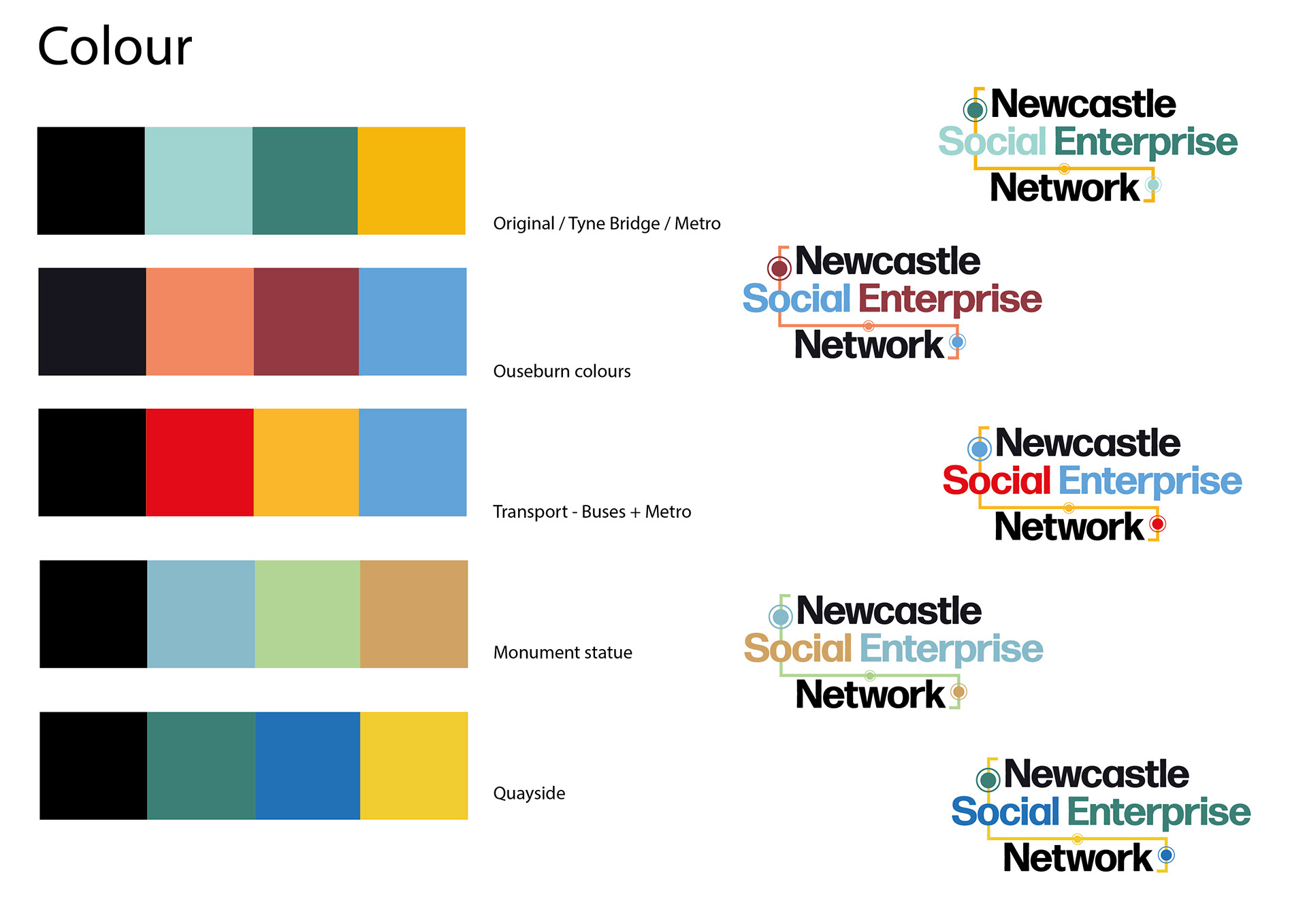
The client informed me that she wanted to use one of my sketches I had explored in my development design. I refined this concept and met the client's criteria. I offered variations with typography and colour, however the client liked the original design the most and used it for their company. I also designed a refined set of brand guidelines to make sure the logo would be used correctly.
