I was asked by a client to design a prototype for a website acting as a directory for Social Enterprises in Newcastle. I used Figma to design the website. I had to consider how the visitors would navigate the site and the database, who would visit the site and what kinds of elements they would interact with. My goal was to keep the design as simplistic as possible and communicate the aim to advertise local businesses in Newcastle. I also designed a section that would help Social Enterprises find a variety of resources that would help their business thrive. I designed a sitemap, a user journey, a user flow, wireframes and three different kinds of prototyping: Low Fidelity, Mid Fidelity and High Fidelity prototyping.
Figma Demo: https://www.figma.com/proto/ZqCA2sHPovRGp8J2xNRxXc/Wireframe-Prototype?node-id=105-6496&node-type=canvas&t=AZqnu0JEAGR5mhyO-0&scaling=scale-down&content-scaling=fixed&page-id=105%3A6468&starting-point-node-id=105%3A6496

Customer Journey Map
I designed a customer journey map to consider who the target audience was, why they would want to interact with the website, how they were informed about the website and what they want from the website. This research and conceptual thinking helped to construct the wireframes and prototypes.

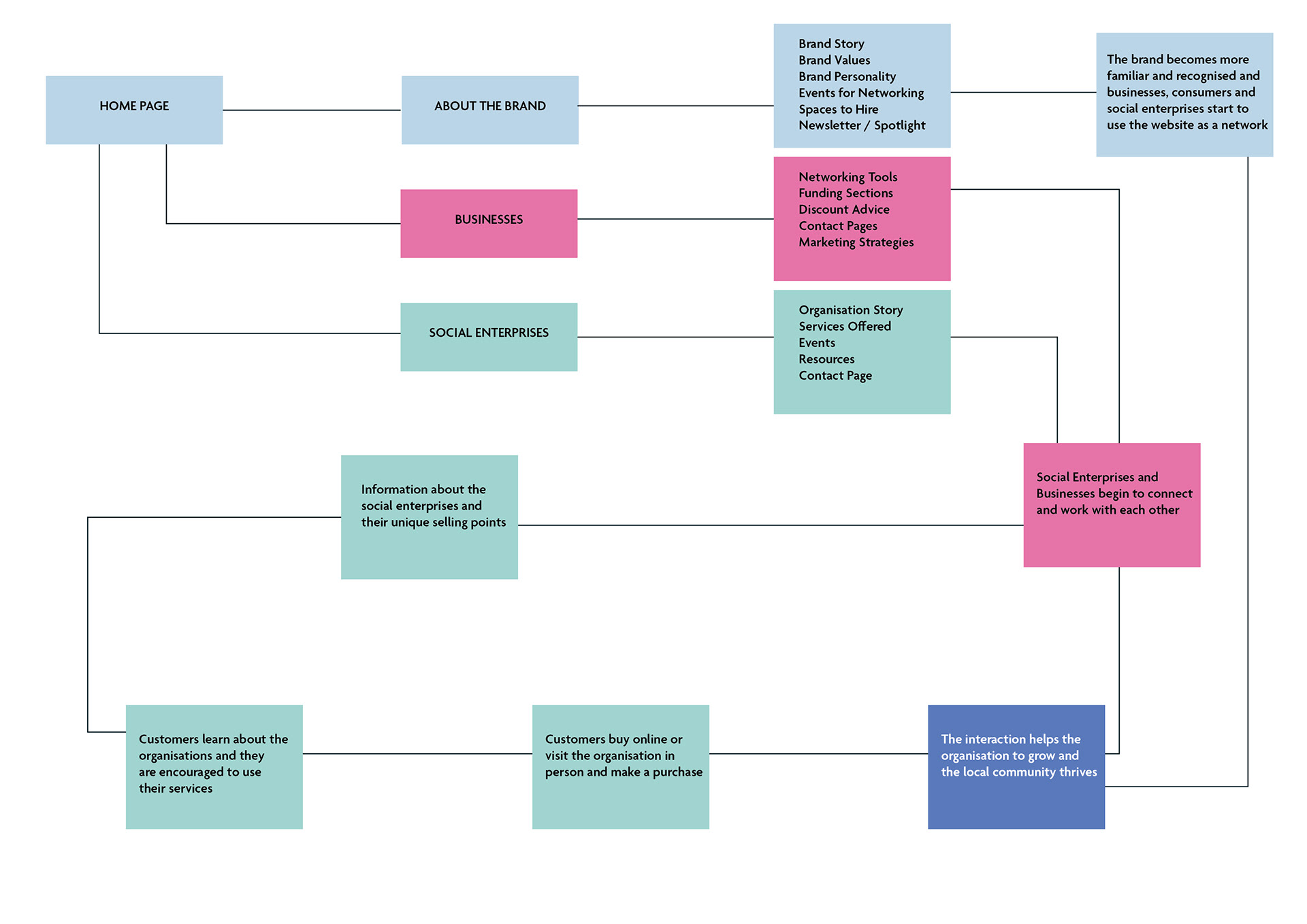
I then designed a sitemap to prioritise how the visitors to the website accessed the information, what they would want to see and how Social Enterprises and Businesses could use the website to promote their organisation. I also designed a user flow to explore what would happen if users clicked on certain buttons. The squares with different categories in them act as a drop down feature which would then lead to the user exploring the rest of the website. The square in blue highlights the ultimate goal for the website.

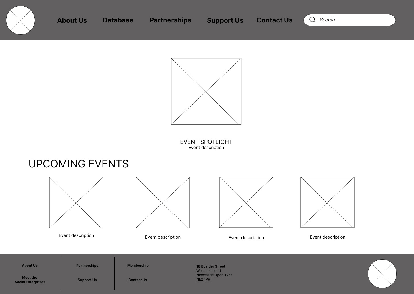
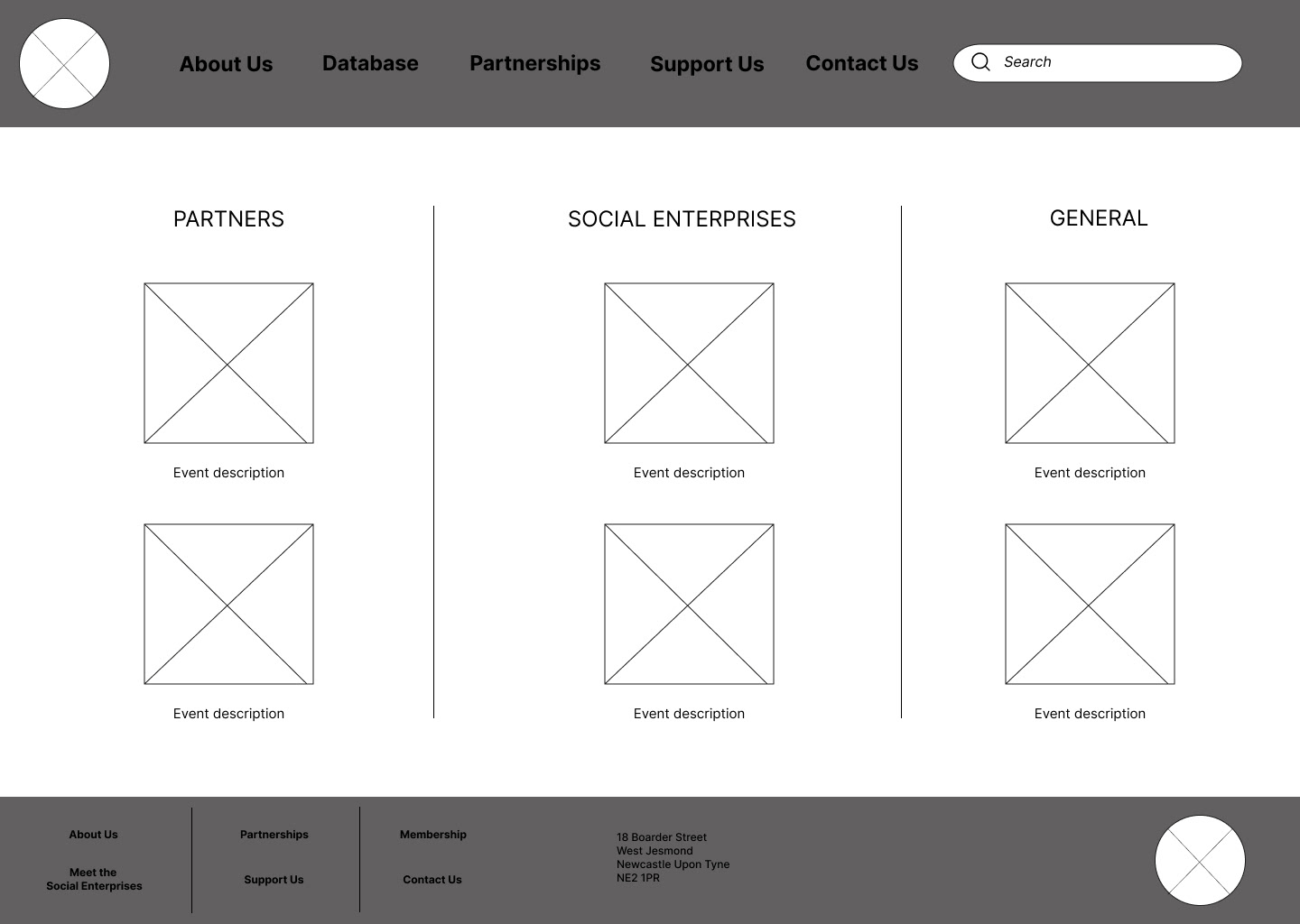


These wireframes help me to create a simplistic website layout and to analyse any elements or features that I may need to add or improve on. An important request from the client was to feature a directory of Social Enterprises and to feature a Newsletter which would highlight different organisations each month.


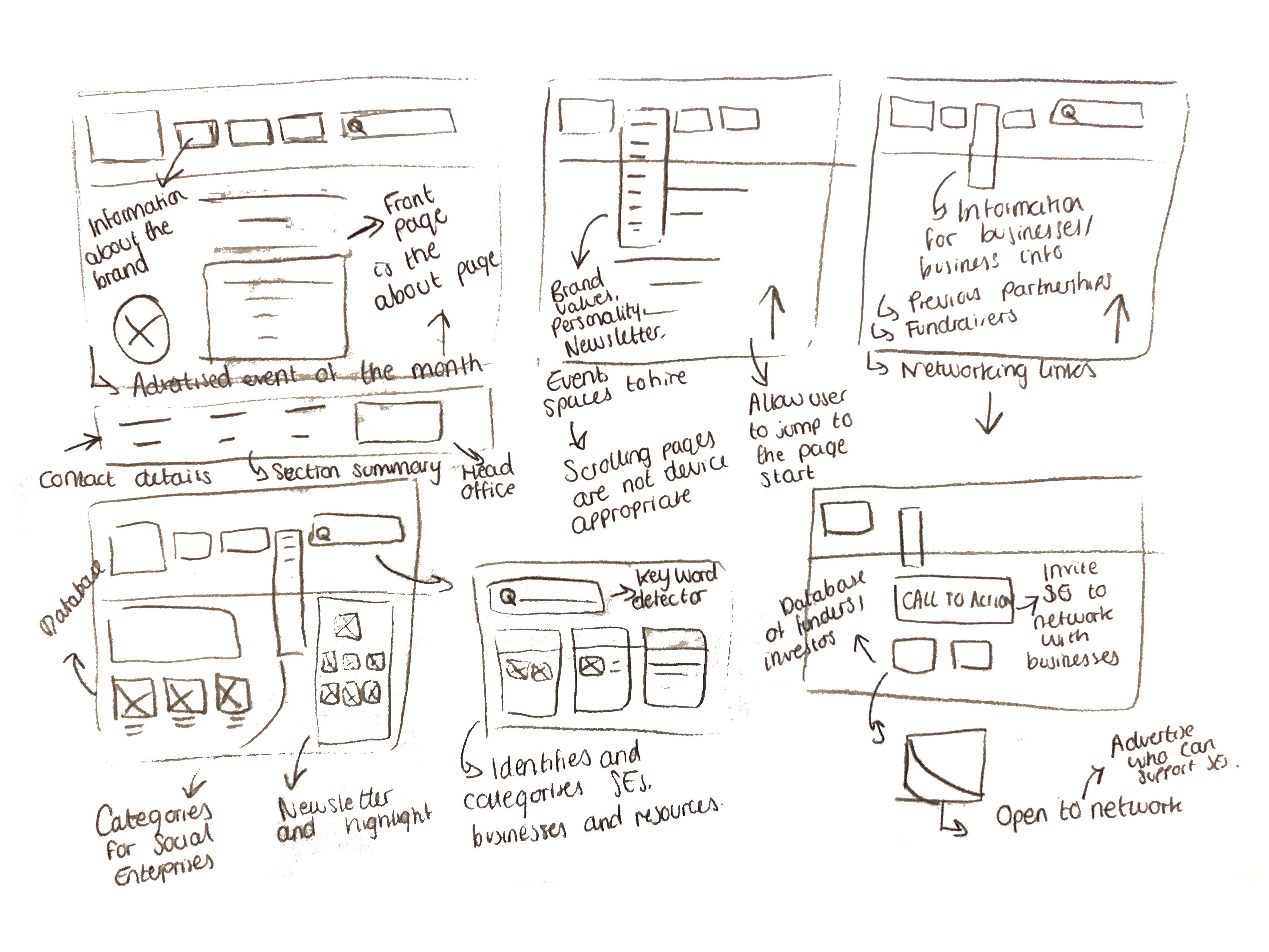
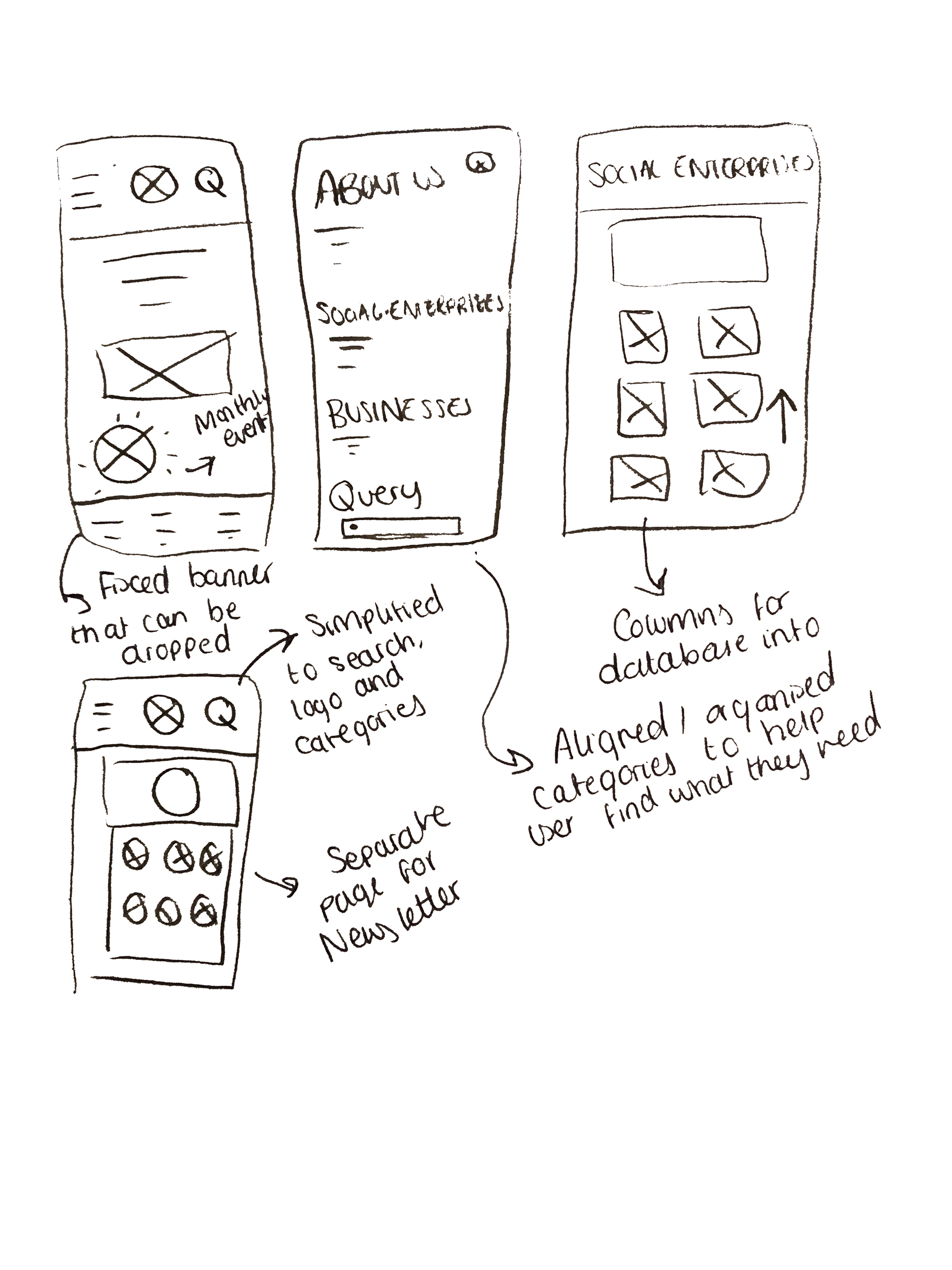
The low fidelity prototype developed the wireframes to a cleaner and more legible layout. In this design there are no images or colours to gain an understanding of element positioning on the website.

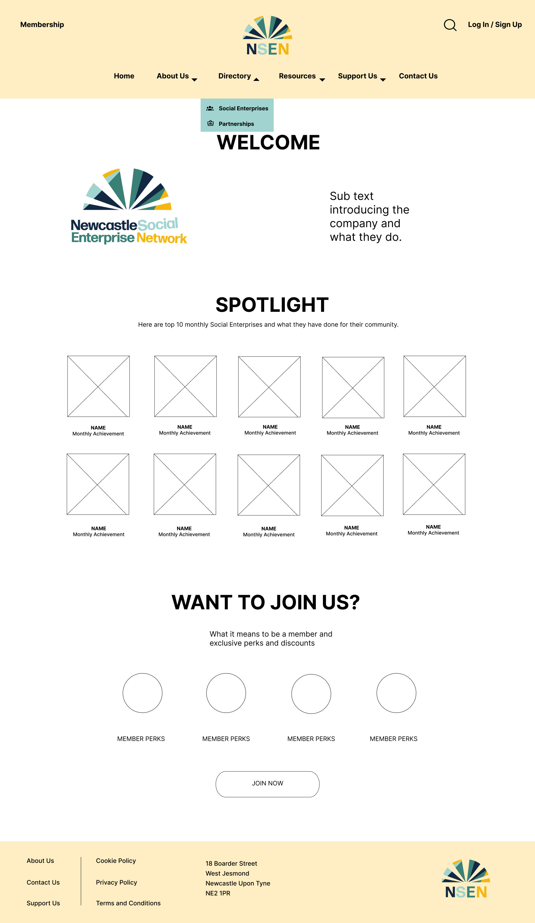
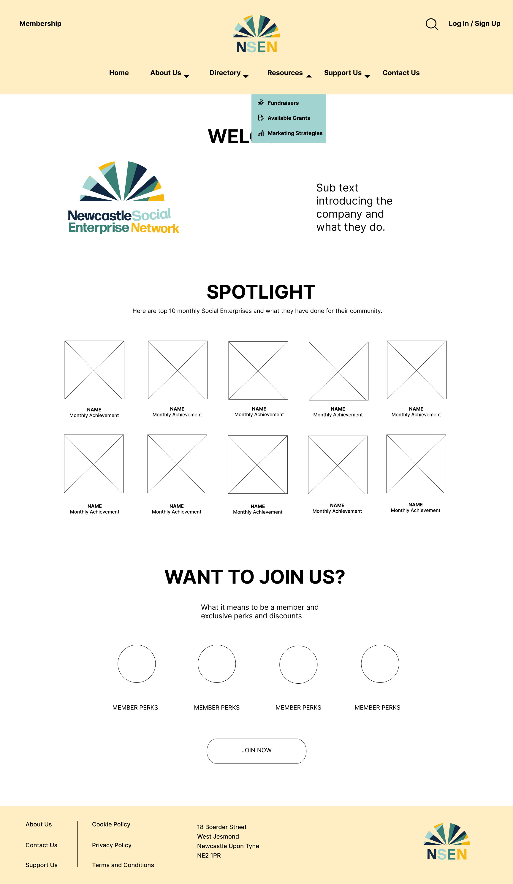
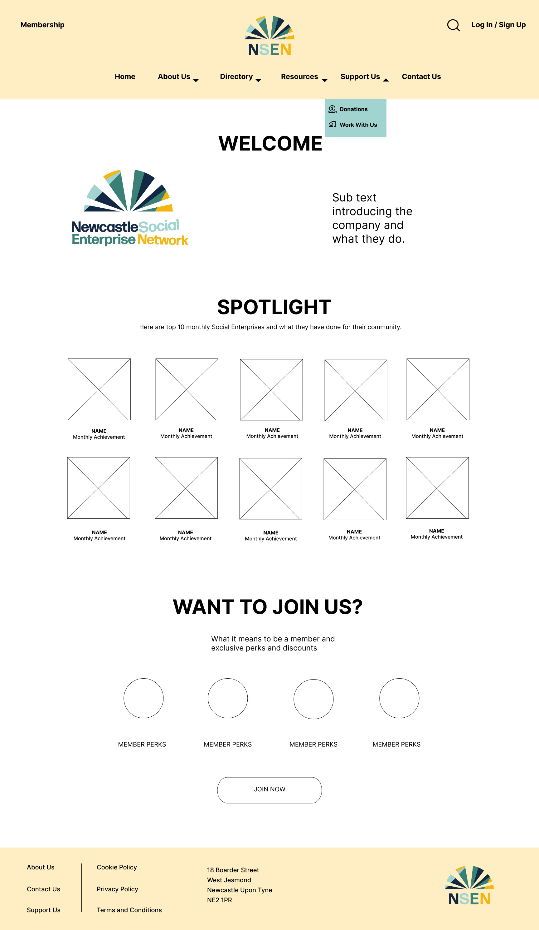
In the mid fidelity prototype I have started to select a colour scheme based off the logo colours and I have placed the logo to idealise how the components work together. I have also been adding buttons and links to explore how the design functions as a website.


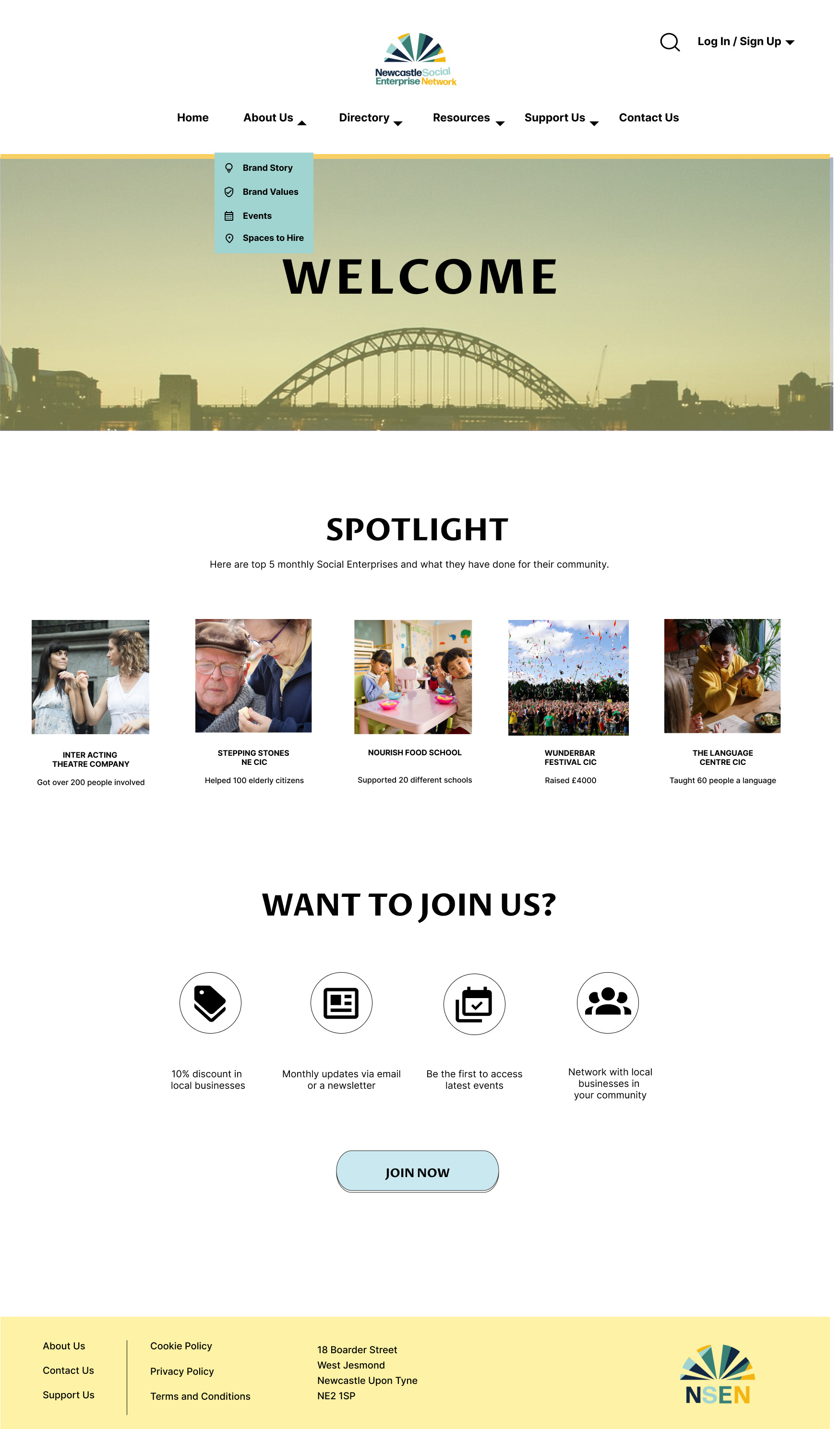

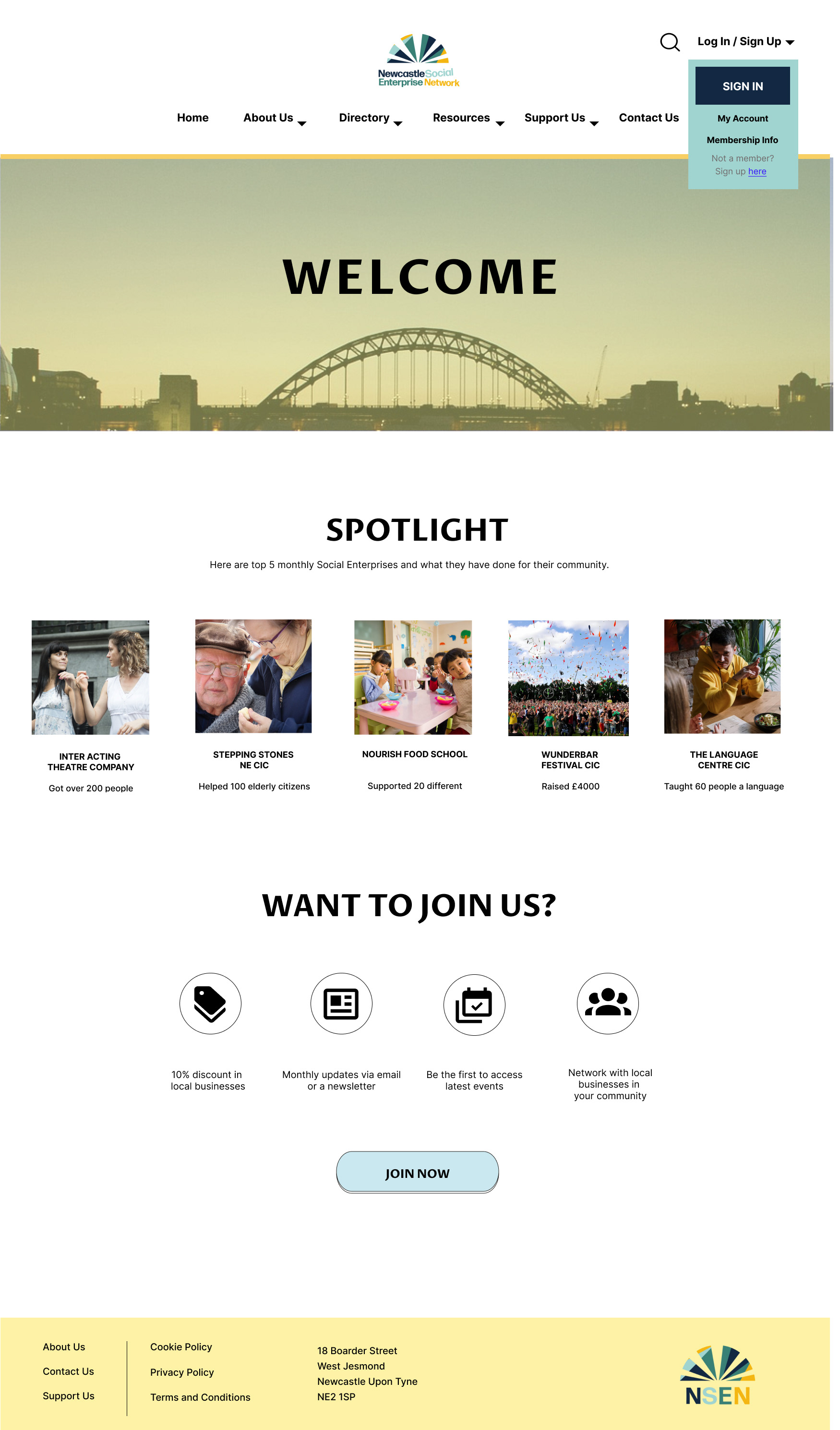

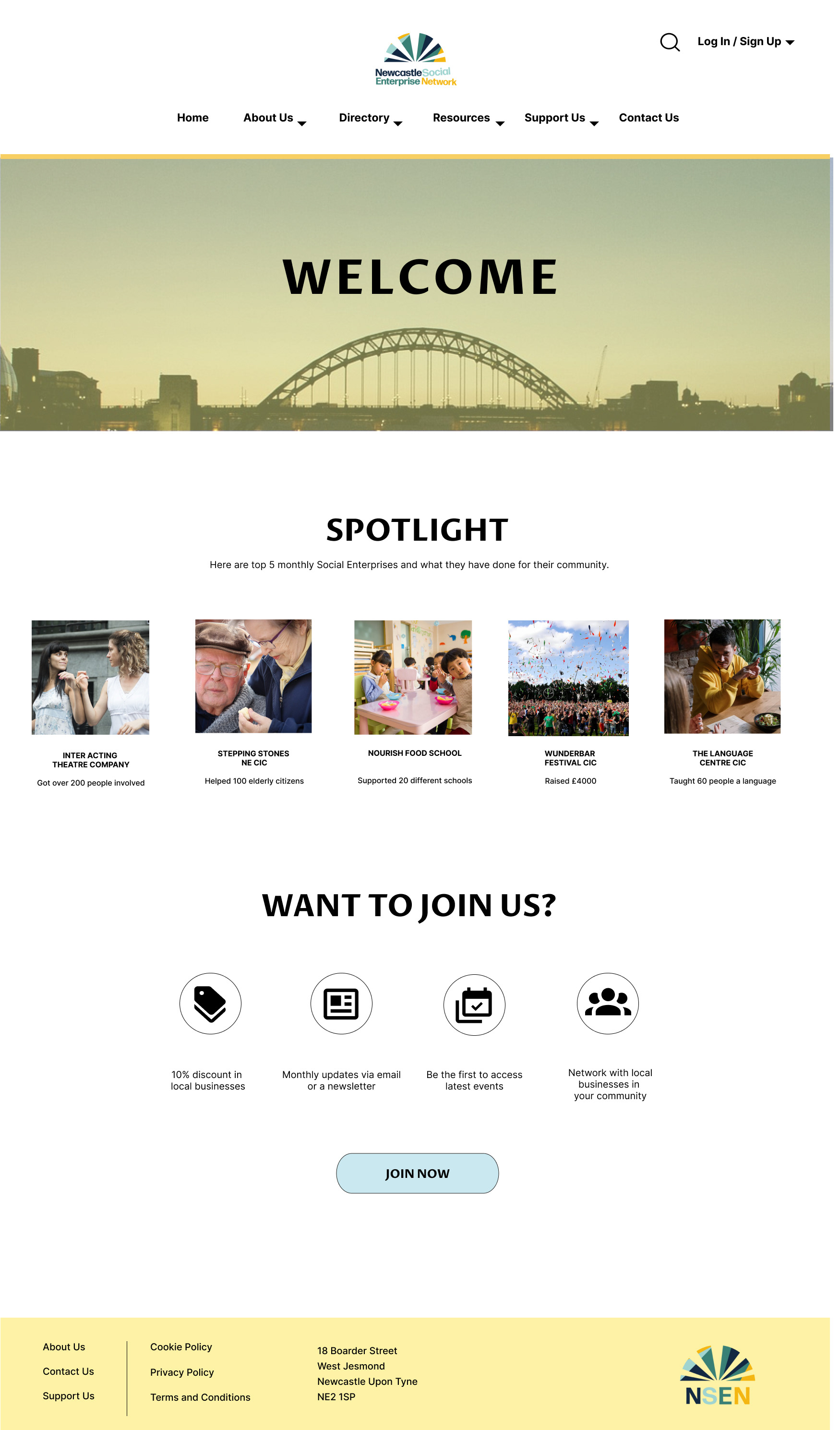
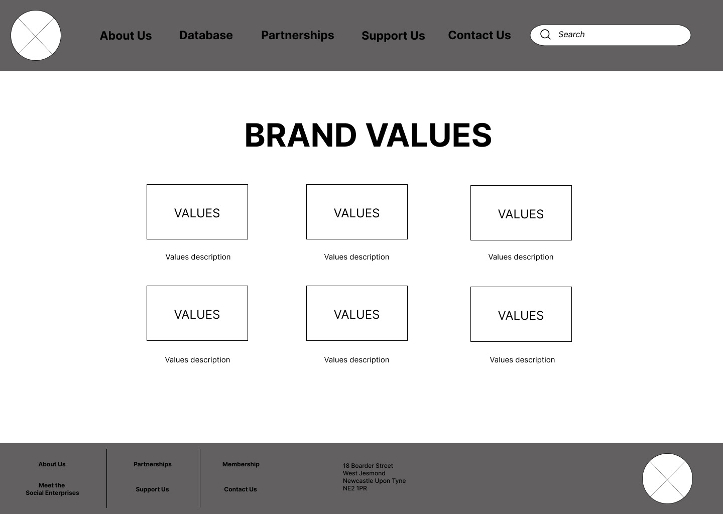
In the high fidelity prototype I have demonstrated a variety of working pages. The entire website is not yet complete as the aim was to demonstrate to the client how the user would navigate the website. I have designed a log in page, a membership and sign up page, pages for each of the headings, a home navigation by pressing the logo and the 'Home' button, as well as a Contact page.